Introduction
This is Part 2 of an article introducing R for patent analytics that focuses on visualising patent data in R using the ggplot2 package.
In Part 1 we introduced the basics of wrangling patent data in R using the dplyr package to select and add data. In this article we will go into more detail on these functions. We then focused on using qplot from the ggplot2 package to illustrate the ease with which graphics can be created and edited in R. In this article we will focus on ggplot and the Grammar of Graphics. As in Part 1 we assume that you are new to R and make no assumptions about familiarity with R. However, you must have RStudio installed on your computer (see Part 1) for instructions. We will also move a little faster on some of the initial steps than in Part 1.
The majority of examples in this article are based on the list of recipes for generating graphics using ggplot2 in Winston Chang's R Graphics Cookbook and the accompanying website.
This article is a work in progress and will be updated as solutions are identified to some of the issues encountered in graphing using ggplot2. Please feel welcome to add comments to this post, particularly where you identify a solution to issues.
The Grammar of Graphics
ggplot2 is an implementation of Leland Wilkinson’s Grammar of Graphics by Hadley Wickham at RStudio as described in this article and ggplot2 book. Hadley Wickham’s grammar differs from the original by focusing on layered approach to building statistical graphics.
The grammar of graphics is an approach to building graphics based on the idea that any statistical graphic can be built from the following components:
- A data set
- A set of aesthetic or
aesattributes such as size, shape & colour - Statistical transformations
- A geometric object
geomor set of objects (geoms) for the type of plot e.g. line, bar or map - scales for the above
- A coordinate system (e.g. a grid or map)
- Faceting (trellising)
In practice, this breaks down into three main elements:
A base object. The first two of these components combine into a base object consisting of the data set and aesthetic mappings or
aesfor the particular data we want to see. That includes the axes and any fill or line colours.geomsor geometric objects. We then add one or moregeomto specify the form in which we want to see the data we have selected in 1. This tends to also involve a statistical transformation (such as placing data into bins for a bar chart). Defaults deal with some of this. However, a statistical transformation orstatcan also be specified.A coordinate system. We normally don’t need to think about this. The default is a standard Cartesian grid. However, this can be changed to a fixed grid or a polar grid.
An easy way to think about it is that
- The base object defines what we want to see.
- The geoms define the form we want to see it in.
- The coordinate system defines the framework for the visualisation.
As with any grammar it can take a while to get used to its terms and peculiarities. The good news is that there are plenty of free resources out there for this very popular package.
- Winston Chang’s R Graphics Cookbook website is a very valuable practical guide to most things you will want to do with ggplot2. The full R Graphics Cookbook goes into a lot more detail and is an invaluable reference if you will be doing a lot of work with graphics in R. Those with budgets may also want to invest in Hadley Wickham’s book ggplot2 published by Springer.
- RStudio have developed a very helpful cheat sheet that you can download here or view here. We suggest downloading and printing the cheat sheet when using ggplot2.
##Getting Started
If you don’t have these packages already then install each of them below by pressing command and Enter at the end of each line. As an alternative select Packages > Install in the pane displaying a tab called Packages. Then enter the names of the packages one at a time without the quotation marks.
install.packages("readr")
install.packages("dplyr")
install.packages("ggplot2")
install.packages("ggthemes")
Then make sure the packages have loaded to make them available. Press command and enter at the end of each line below (or, if you are feeling brave, select them all and then click the icon marked Run).
library(readr)
library(dplyr)
library(ggplot2)
library(ggthemes)
You are now good to go.
###Loading the Data
We will load the pizza dataset directly from the Github datasets repository using read_csv from the readr package. If downloading from the repository note that it is the View Raw file that you want. If loading from a downloaded file include the full file path inside quotation marks.
pizza <- read_csv("https://github.com/poldham/opensource-patent-analytics/blob/master/2_datasets/pizza_medium_clean/pizza.csv?raw=true")As in Part 1 we will use dplyr to create a count field using the publication number, rename some of the fields and then select fields we want to count.
###Reviewing and Preparing the Dataset with dplyr
Inspecting our data is a first step. Type View(pizza) in the console to see the table and str(pizza) to see its structure.
In practice we have a number of issues that we will want to fix.
- We have a blank row at the bottom of the dataset that we will want to remove because it will produce a red error message. It does not have to be removed but this will help in interpreting any error messages.
- Patent data commonly doesn’t contain numeric fields. Data fields are mainly characters or dates with the exception at times of cited and citing counts. We will want to add a count column.
- We will not be working with all 31 columns in
pizzaand so we will want to select just those we will be working with. - To save typing we may want to rename some of the columns (and we can revert the names later if need be).
- Some data may be missing for particular countries. For example, for Canada some of the entries are missing a year field. That may be fine for raw totals but not for charting by year.
To handle these tasks we can use the very useful functions in dplyr. For other tasks we might also want to use tidyr or plyr as sister packages to dplyr. dplyr's main functions are described here. These are the functions we think you will find most useful with patent data.
- filter() and slice()
- arrange()
- select()
- distinct()
- mutate()
- summarise()
- group_by()
- count()
dplyr functions are important because they will help you to easily extract elements of the data for graphing. They can also be very useful for basic patent analysis workflows where tools such as Excel or Open Office will struggle. For more on wrangling data using dplyr and tidyr see the RStudio Data Wrangling Cheatsheet. dplyr also includes pipes, such as %>% (meaning then) that can be used to string together chunks of code in an efficient and easy to use way. We will illustrate the use of pipes in this article but will not use pipes throughout as we are adopting a simple step by step approach. As you become more familiar and comfortable with R we suggest that you increasingly start to work with pipes to make your life easier. We caution against leaping into pipes when learning R. While they are very easy to use and efficient, they are still relatively new. That can make reading ‘normal’ R code difficult until you are more familiar with it.
We will now use two dplyr functions.
First we will add a column with a numeric value for each publication number in the dataset using mutate. mutate takes an argument applied to the values of one or more columns and adds a new column based on that argument. Here, as in Part 1 we simply add a new column called n that uses sum() to award each publication number the value of 1. We now have a numeric count column n from our character vectors.
pizza <- mutate(pizza, n = sum(publication_number = 1))Next we will rename the columns to make life easier using rename(). The code has been indented to make it easier to read. To run this code, select the code and press Run in R or press command and enter.
pizza <- rename(pizza,
                pubcountry = publication_country_name,
                pubcode = publication_country_code,
                pubyear = publication_year
                )
pizza
## # A tibble: 9,996 x 32
## applicants_cleaned applicants_clean… applicants_orga… applicants_original
## <chr> <chr> <chr> <chr>
## 1 <NA> People <NA> <NA>
## 2 Ventimeglia Jamie Jo… People <NA> Ventimeglia Jamie …
## 3 Cordova Robert; Mart… People <NA> Cordova Robert;Mar…
## 4 Lazarillo De Tormes … Corporate Lazarillo De To… LAZARILLO DE TORME…
## 5 <NA> People <NA> <NA>
## 6 Depoortere, Thomas People <NA> DEPOORTERE, Thomas
## 7 Frisco Findus Ag Corporate Frisco Findus Ag FRISCO-FINDUS AG
## 8 Bicycle Tools Incorp… Corporate Bicycle Tools I… Bicycle Tools Inco…
## 9 Castiglioni, Carlo People <NA> CASTIGLIONI, CARLO
## 10 <NA> People <NA> <NA>
## # ... with 9,986 more rows, and 28 more variables: inventors_cleaned <chr>,
## # inventors_original <chr>, ipc_class <chr>, ipc_codes <chr>,
## # ipc_names <chr>, ipc_original <chr>, ipc_subclass_codes <chr>,
## # ipc_subclass_detail <chr>, ipc_subclass_names <chr>,
## # priority_country_code <chr>, priority_country_code_names <chr>,
## # priority_data_original <chr>, priority_date <chr>, pubcode <chr>,
## # pubcountry <chr>, publication_date <chr>, publication_date_original <chr>,
## # publication_day <int>, publication_month <int>, publication_number <chr>,
## # publication_number_espacenet_links <chr>, pubyear <int>,
## # title_cleaned <chr>, title_nlp_cleaned <chr>,
## # title_nlp_multiword_phrases <chr>, title_nlp_raw <chr>,
## # title_original <chr>, n <dbl>We now want to create 4 data tables:
- p1 as a reference set with four columns
- pc = publication country totals
- pt = publication totals by year
- pcy = publication country by year
We will create a new working table called p1 that contains just the data we want to work with using dplyr's select(). select() will only include columns that we name and will drop the others from the new table.
p1 <- select(pizza, pubcountry, pubcode, pubyear, n)p1 will be our reference set and contains 4 columns, use View(p1) to see it.
If we were to inspect this data we would see that we have some sparse results dating back to the 1940s. In the last article we controlled for this in graphs using xlim to limit the x axis to specific years. Here we will remove that data.
To remove the sparse years we need to use dplyrs filter function. filter is basically the equivalent of select for rows. Rather than naming each of the years that we want to remove we will us an operator for values equal or greater than 1970 >=. We will also want to pull back from the data cliff in more recent years as discussed in Part 1. To do that we will add a second argument to filter for years that are equal to or below 2012 <=. Note here that dplyr functions can take more than one argument at a time. So we do not need to repeat the function for each filter operation. For a list of other operators see this quick table.
p1 <- filter(p1, pubyear >= 1970, pubyear <= 2012)We can now go ahead and create a publication total table pt using count() in dplyr. count is actually a wrapper for two other dplyr functions, group_by and summarise. We do not need to use those because count does that for us. Note here that wt for weight will sum the value of n for us (see ?count for details).
pt <- count(p1, pubyear, wt = n)If we inspect pt we will see that we now have totals for each year. We might want to add a rank or percentage column to that for later use. There are a variety of ways of going about this. However, staying with dplyr, behind the scenes count function has grouped the data for us (see ?count). To understand this use str(pt) in the console to view the data. This will reveal that we have a grouped data frame with attributes. To go further we will ungroup the table first. [Note that ungrouping is not normally necessary but is used here because of an unexpected problem calculating a percentage on a grouped table using sum(n) in dplyr].
pt <- ungroup(pt)As with filter we can pass multiple arguments to mutate. To demonstrate this we will add a column with a percentage score, then use ntile to split the data into 3 groups and then calculate the percent rank using percent_rank(nn)
pt <- mutate(pt, group = ntile(nn, 3),
             percent = nn / sum(nn) * 100,
             rank = percent_rank(nn))
pt
## # A tibble: 43 x 5
## pubyear nn group percent rank
## <int> <dbl> <int> <dbl> <dbl>
## 1 1970 2. 1 0.0223 0.
## 2 1971 6. 1 0.0668 0.0238
## 3 1972 14. 1 0.156 0.119
## 4 1973 9. 1 0.100 0.0714
## 5 1974 7. 1 0.0780 0.0476
## 6 1975 11. 1 0.123 0.0952
## 7 1976 27. 1 0.301 0.190
## 8 1977 24. 1 0.267 0.143
## 9 1978 30. 1 0.334 0.214
## 10 1979 26. 1 0.290 0.167
## # ... with 33 more rowsThis neatly demonstrates how easy it is to use mutate to add columns based on different calculations.
The reason that we are focusing on adding counts to the publication total table is that when graphing later we can use these columns to split and order the graphics. This is particularly helpful because with patent data we normally have widely varying scores that produce crunched graphs. The availability of either buckets or percentages is very helpful for creating ranked bar charts or plots and faceting (trellis graphs). As we often want to see what happens with a graph before deciding how to proceed or drop data it is useful to have a ranking system. We can then filter the data using function at a later stage.
###Creating a Publication Country Table
We will follow the same procedure for the publication country table. However, in this case we will illustrate the use of pipes to simplify the process. We will use the most common pipe %>%, which means “then”. This basically says, “this” then “that”. Select and run the code.
pc <- count(p1, pubcountry, pubcode, wt = n) %>%
    ungroup() %>%
    mutate(group = ntile(nn, 3),
           percent = nn / sum(nn) * 100,
           rank = percent_rank(nn)) %>%
    arrange(desc(nn))
print(pc)
## # A tibble: 16 x 6
## pubcountry pubcode nn group percent rank
## <chr> <chr> <dbl> <int> <dbl> <dbl>
## 1 United States of America US 4267. 3 47.5 1.000
## 2 Patent Co-operation Treaty WO 1390. 3 15.5 0.933
## 3 Canada CA 1316. 3 14.7 0.867
## 4 European Patent Office EP 1184. 3 13.2 0.800
## 5 Korea, Republic of KR 308. 3 3.43 0.733
## 6 Japan JP 205. 2 2.28 0.667
## 7 Germany DE 89. 2 0.991 0.600
## 8 South Africa ZA 72. 2 0.802 0.533
## 9 China CN 60. 2 0.668 0.467
## 10 Israel IL 35. 2 0.390 0.400
## 11 Mexico MX 23. 1 0.256 0.333
## 12 Portugal PT 10. 1 0.111 0.200
## 13 Russian Federation RU 10. 1 0.111 0.200
## 14 Eurasian Patent Organization EA 4. 1 0.0446 0.133
## 15 Spain ES 3. 1 0.0334 0.0667
## 16 Singapore SG 2. 1 0.0223 0.While we will not focus on using pipes in this article, they simplify the writing of code in R and make it clearer. The above code is identical to the code below. However, note that in the code below we have to keep overwriting each time we add an element. Also note that in the code above we only mention our reference table, p1, once at the beginning whereas in the version without pipes or chaining, we have to mention it as the first argument of each function.
pc <- count(p1, pubcountry, pubcode, wt = n)
   pc <- ungroup(pc)
   pc <- mutate(pc, group = ntile(nn, 3),
                percent = nn / sum(nn) * 100,
                rank = percent_rank(nn))
   pc <- arrange(pc, desc(nn))
   pc
## # A tibble: 16 x 6
## pubcountry pubcode nn group percent rank
## <chr> <chr> <dbl> <int> <dbl> <dbl>
## 1 United States of America US 4267. 3 47.5 1.000
## 2 Patent Co-operation Treaty WO 1390. 3 15.5 0.933
## 3 Canada CA 1316. 3 14.7 0.867
## 4 European Patent Office EP 1184. 3 13.2 0.800
## 5 Korea, Republic of KR 308. 3 3.43 0.733
## 6 Japan JP 205. 2 2.28 0.667
## 7 Germany DE 89. 2 0.991 0.600
## 8 South Africa ZA 72. 2 0.802 0.533
## 9 China CN 60. 2 0.668 0.467
## 10 Israel IL 35. 2 0.390 0.400
## 11 Mexico MX 23. 1 0.256 0.333
## 12 Portugal PT 10. 1 0.111 0.200
## 13 Russian Federation RU 10. 1 0.111 0.200
## 14 Eurasian Patent Organization EA 4. 1 0.0446 0.133
## 15 Spain ES 3. 1 0.0334 0.0667
## 16 Singapore SG 2. 1 0.0223 0.Note that we have added the function arrange and given it the value of n. Arrange will sort a table on a column in ascending order by default and descending order using desc inside the function as in this case. Use View(pc) to take a look. To reverse the order try the code below.
pc <- arrange(pc, nn)This will arrange the pc data by the value of n in the default ascending order.
###Creating a Publication Country by Year Table
For the publication country by year we do the same but retain all the columns.
pcy <- count(p1, pubcountry, pubcode, pubyear, wt = n) %>% ungroup()
pcy
## # A tibble: 296 x 4
## pubcountry pubcode pubyear nn
## <chr> <chr> <int> <dbl>
## 1 Canada CA 1971 2.
## 2 Canada CA 1972 4.
## 3 Canada CA 1974 1.
## 4 Canada CA 1975 1.
## 5 Canada CA 1976 1.
## 6 Canada CA 1977 1.
## 7 Canada CA 1978 4.
## 8 Canada CA 1979 8.
## 9 Canada CA 1980 11.
## 10 Canada CA 1981 14.
## # ... with 286 more rowsWe now have a table that sums up the values by country and year. However, we are now presented with a conundrum. We have lost our groups and ranks. We cannot simply repeat what we did before (e.g. ntile) because the data is now split by year and it will not assign correctly. In addition, using other functions is made difficult by the fact our columns are character columns.
One solution to this conundrum is to join the pcy and the pc tables together using the join functions in dplyr. We will start by creating a temporary table that we will call df and use select to drop the columns we don’t want, then we will create a new pcy using left_join from dplyr (see join).
df <- select(pc, pubcode, group)
  pcy <- left_join(pcy, df)
We now have a publication country by year table where groups are assigned as in the previous table. Note that for a join to be made the table must possess one or more shared columns that serve as a key for the join (in this case the shared key is pubcode). It can be a very good idea to retain a field to use as a shared key where you expect to be joining data at a later stage. Also note that this is one solution, it is not necessarily the best or most efficient solution.
We could also break our publication countries into separate tables using to select only those rows in a group we want. Here we create three tables based on the groups assigned to them where they match the group number using ==.
main <- filter(pcy, group == 3)
other <- filter(pcy, group == 2)
low <- filter(pcy, group == 1)
In practice, we do not always need to create separate tables, however, as we can now see the combination of select for columns and filter for rows in makes it easy to create subsets of our data. We have also seen that functions such as left_join can come in useful where we cannot easily repeat the creation of a variable in a table divided on different variables. While there are almost always other ways of doing things in R, dplyr and its sister packages tidyr and plyr aim to make everyday data preparation and analysis tasks easier.
We now have four data tables and in the following sections we will work with:
- pt = the publication total data
- pc = the publication country data
- pcy = the publication country by year table
We will be working through graph creation in a step wise direction so that you can see what is happening at each step. In the process we will create multiple objects. This is not the fastest way to proceed. However, it is transparent in mapping out the steps and the consequences of small chunks of code. Faster ways include using pipes as we have seen above. We have initially chosen the slower route to explain what is going on. However, you may want to experiment with pipes on some of the code at the end of this article.
This section has usefully reminded us that data preparation is a fundamental step in any patent analysis task including visualisation. Choices made at this stage will determine the ease or difficulty with which we can perform particular visualisation tasks later. However, there is nothing to stop us returning to our data wrangling functions at a later stage. For example, we may well discover that the three bins we have created using ntile should be 4 or we might want to use a calculation to determine the number of bins. This need for adjustment is a normal part of data analysis. For more information on data wrangling in R using dplyr and tidyr see the RStudio Data Wrangling Cheatsheet and Garrett Grolemund’s excellent Data Wrangling with R.
##Getting Going with ggplot in ggplot2
ggplot() basically builds graphics from separate layers. Those layers are added, adjusted and specified in the ggplot function using small chunks of code describing different elements of the graph. Essential background reading here is Winston Chang’s Cookbook for R Graphics website and book along with R-bloggers posts on ggplot2.
###Establishing the Base Object
Most ggplot2 tutorials do not refer to a base object, possibly because it is obvious. However, this term was used in Hadley Wickham’s 2010 article A Layered Grammar of Graphics and helps us to understand the layering process. The base object consists of the data we want to graph and the aesthetic mappings or aes. This is basically what we want to see on a graphic. Using the pt (totals) table we can create a base object t for total as follows.
t <- ggplot(pt, aes(pubyear, weight = nn))This follows the pattern of:
data = pt, aesthetic mappings = (x = publication year, y = the sum of n)
We now have a base object with the aes mappings. Bear in mind that we will need to change this base object for particular types of graph.
If we enter t in the console now then we will see an error message Error: No layers in plot. That is because we haven’t defined how we want to see the data using a geom. So let’s add a geom now.
###Adding a geom
The geometric object is basically the form we want to see the data in plus any additional conditions we might want to set.
For a bar graph (histogram) we would specify t and + for the geom for a bar graph. Inside the geom_bar() function we can add some additional details.
t + geom_histogram(colour = "white", fill = "red")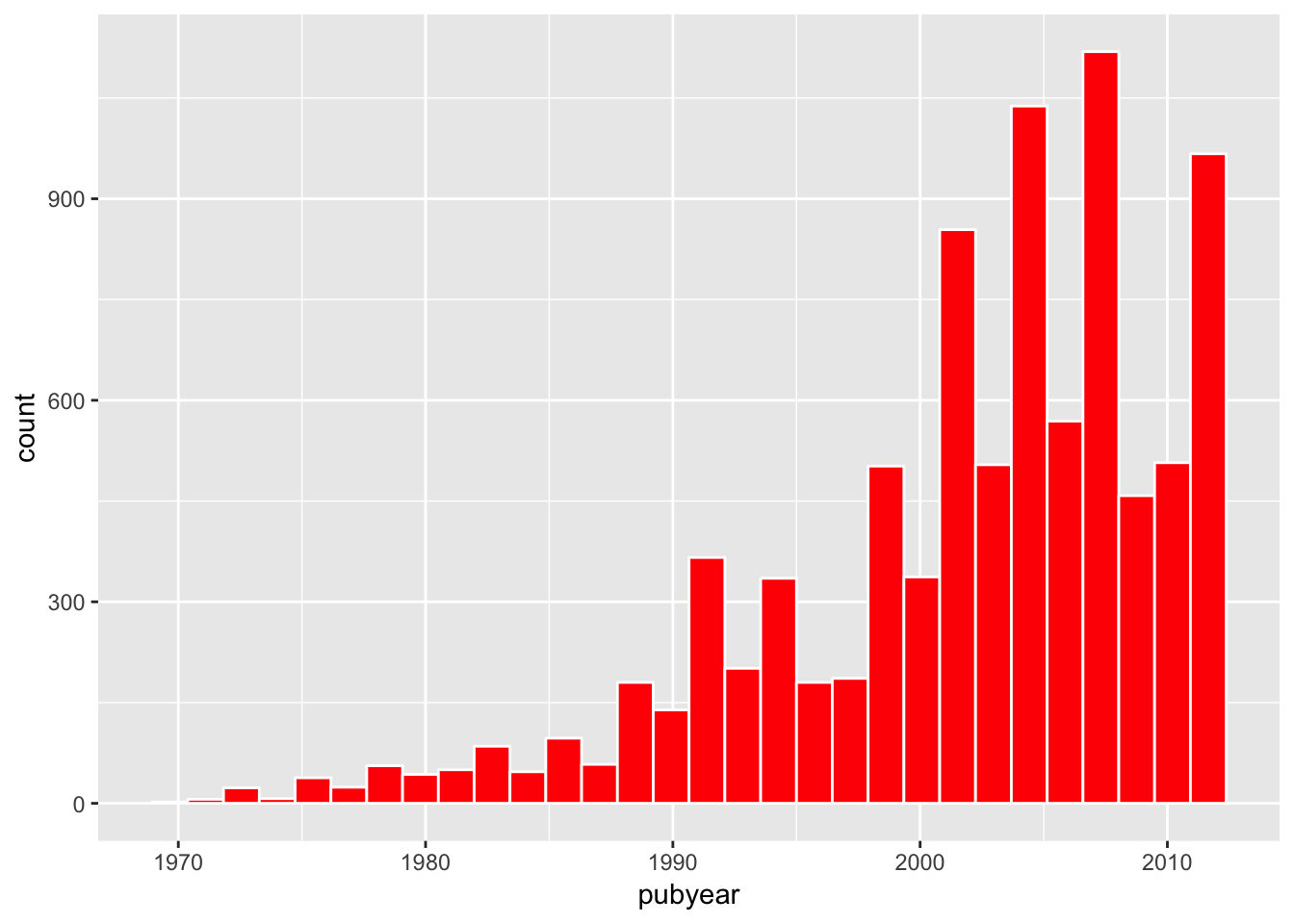
When we press command enter (or enter t in the console) we will now see a bar chart.
The geom specifies what we want to see. Note here that we have:
- Created a white outline around the bars using colour = “white”
- Created a fill using fill = “red”. The default is black.
- We have specified bindwidth = 1 because the default is the range divided by 30. This has been described as “perverse” by Hadley Wickham. It is intended to encourage thought and experimentation in binning data. In this case our base object is weighted to sum on the values of and we want to see the values in a bin for each year.
- The default for counts in a bar chart is a count of cases (number of observations in the bin), not a count of values. For that reason we specified in the base object for the y axis (weight can also be written as ).
###Changing the Geom
If we wanted to change the geom to generate a different kind of graph, such as a line graph we would first need to make an adjustment to our base object. In this case we are specifying that the y axis is n.
l <- ggplot(pt, aes(pubyear, nn, weight = nn))To view this we now specify the geom as line:
l + geom_line()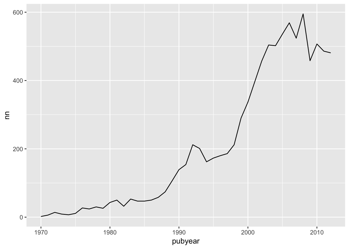
We now have a line graph. Let’s imagine that we wanted to change this to a point (scatter plot).
l + geom_point()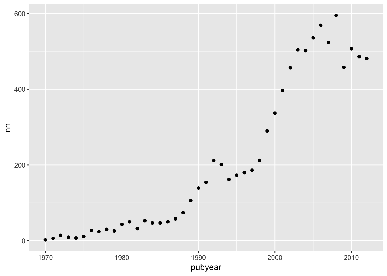
However, now we would like to have a line and a scatterplot.
l + geom_point() +
  geom_line()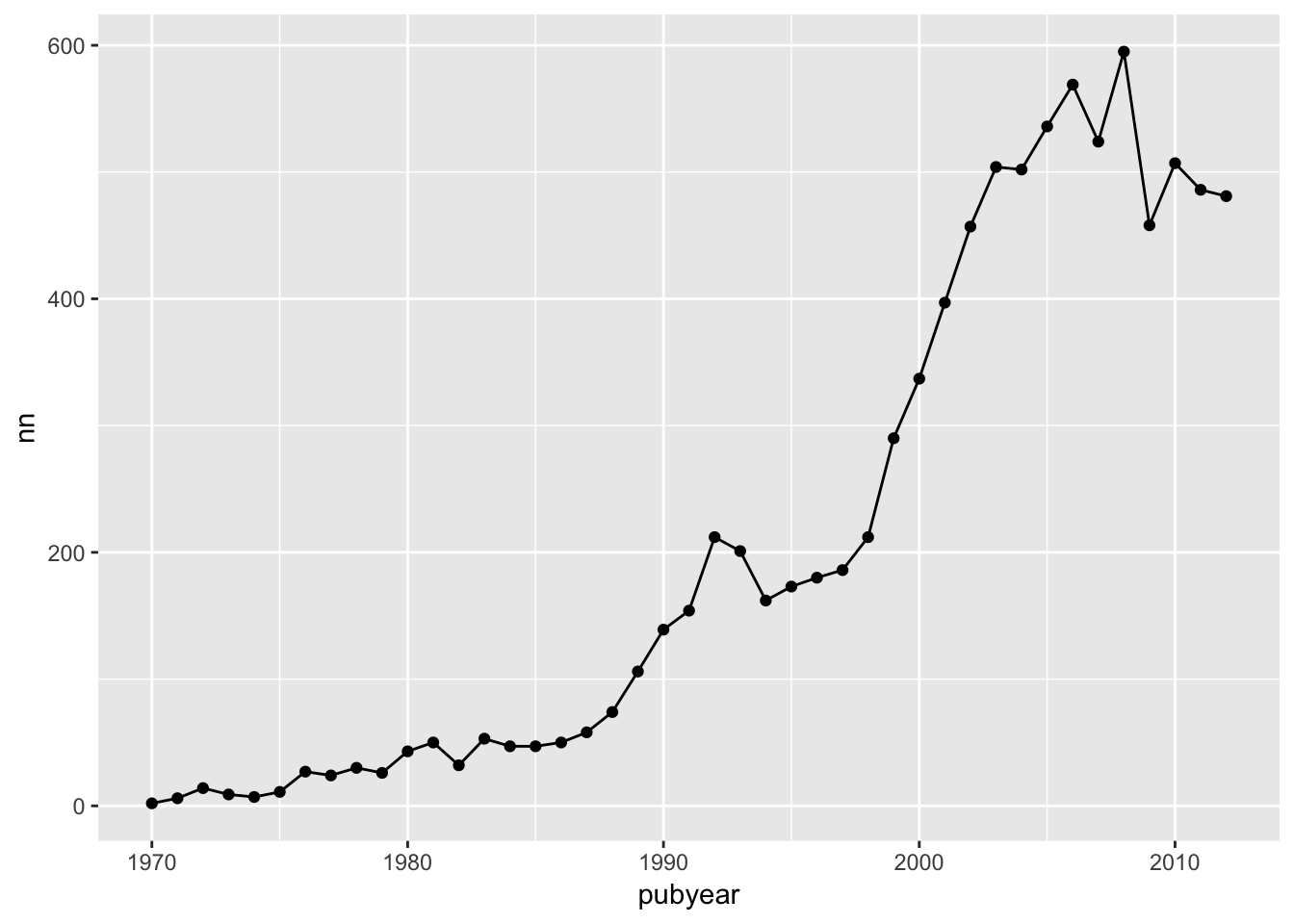
This will then draw a line through our scatterplot points. For the sake of illustration we could add another geom to our list to convert to an area graph.
l + geom_point() +
  geom_line() +
  geom_area()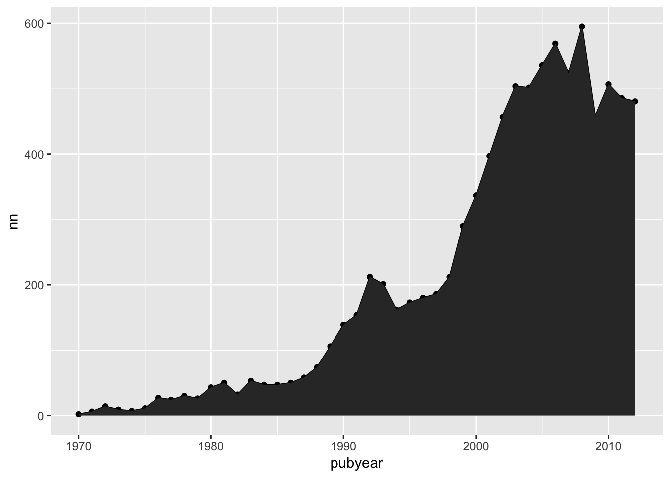
There is clearly not much point in using this combination because the area geom obliterates the other geoms. But, it illustrates that we can play around with adding and removing geometric objects without going back and changing our base object. We are simply adding and removing layers specifying the geometric object(s) we want to see in the plot.
For readers following this article from the previous Tableau Public article note that our area graph is the same as in panel 1 of the Tableau Public version here. To reproduce that in R we will start using themes from the ggthemes package. We will start by creating a base object with no fill specified in l1.
l1 <- ggplot(pt, aes(pubyear, nn, weight = nn, fill=""))We now add layers including the theme. In this case we have chosen theme_igray and specified the font as Helvetica, then scale_fill_tableau specifying the “tableau20” palette. Because something for fill has to be specified in the base object we end up with a legend we don’t need. To remove that when applying the theme we add a + theme(legend.position="none") to drop the legend.
l2 <- l1+ geom_area() +
  theme_igray(base_family = "Helvetica") +
  scale_fill_tableau("tableau20") +
  theme(legend.position="none")
l2
That is very close to the filled graph in our Tableau Public workbook. A range of themes are available as part of ggthemes the package and are well worth exploring.
For illustration, we could add information that augments our understanding of the data. First, we could add a line. Second, we could add a rug to the plot. A rug adds a line for each of the observations in the data.
l2 + geom_line() +
  geom_rug()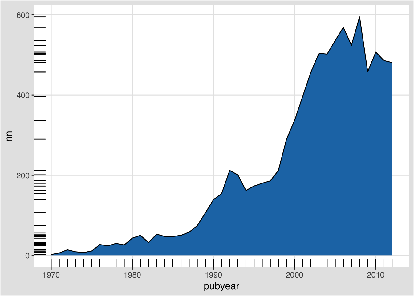
What has happened here is that the addition of geom_rug has added a line to the left and the bottom for each of the observations. Thus, on the x axis, each year gets a tick. On the y axis each observation (value) in the data gains a tick.
What is clear from this is that we do not need a rug for the year. So, let’s change that.
l2 + geom_rug(sides = "l")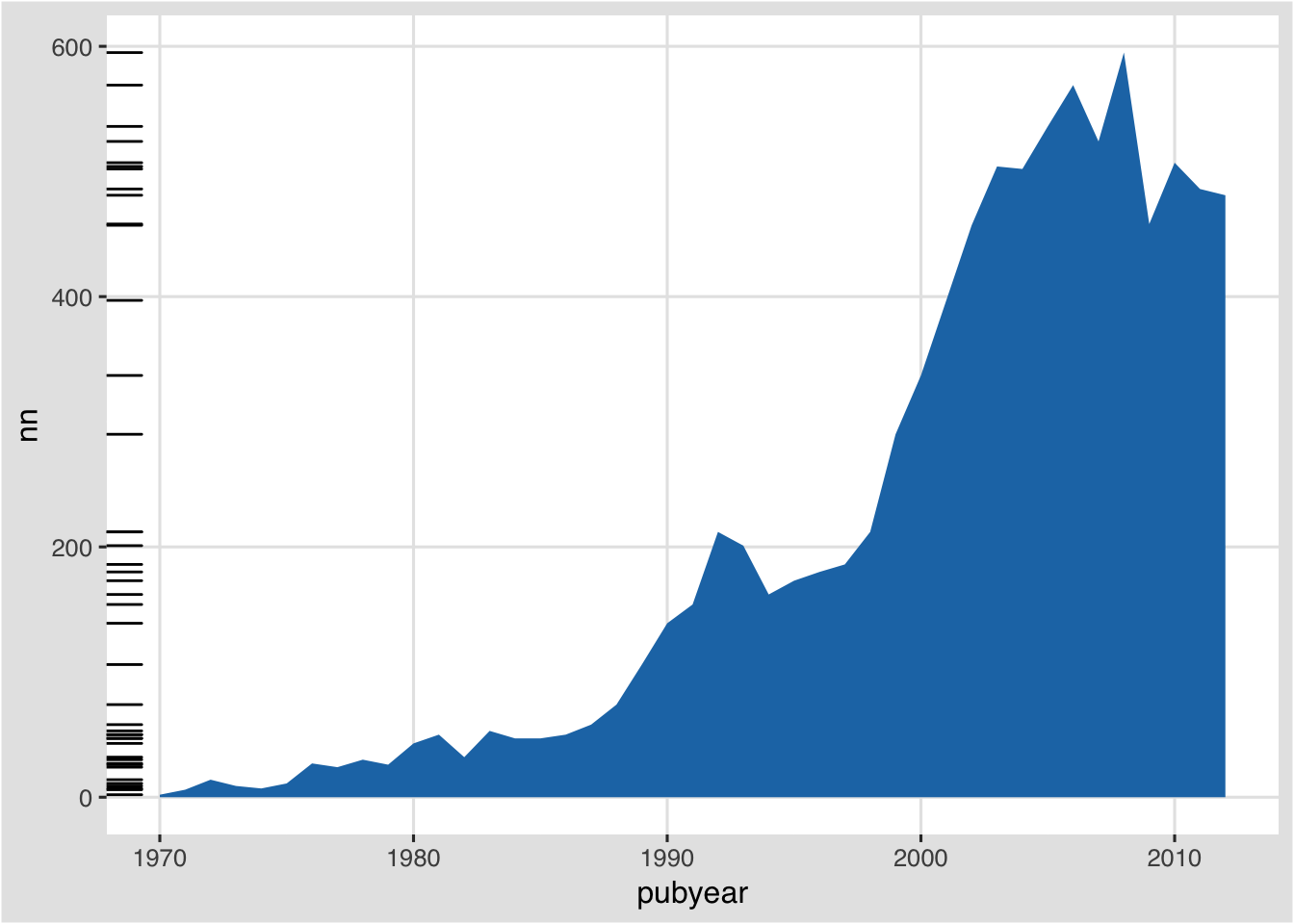
In this case we have specified that the rug should appear on the left (the other options are t, r, b for top, right and bottom respectively).
A rug plot is useful for spotting outliers in the data. In this case it is telling us where the observations that make up the area plot are concentrated over the years. However, again for illustration, we could also use a different dataset to add a rug layer. Let’s try this with our publication country year or pcy table.
Rather than seeing the distribution of the scores for the overall data, we are now seeing the rug by country. This tells us that no country has a score in any year above 300, with the bulk at under 100 per year. Clearly, this is not the best use of a rug, but it is a simple example of adding a layer from a different dataset to augment the information in another dataset. But, it does suggest that the majority of country observations making up the total are concentrated at less than 100 documents per year and two groupings between 200 to 300. The latter are from the US (see the pcy table).
What if we wanted to see the overall trend and the trend for each country on the same graphic? This might initially appear to be difficult because the total data is in the data table and the country year data is in the pcy table. However, they share the same columns and (thanks to Didzis Efferts answer to this stackoverflow question question) we can do that in two steps.
- First we use the ggplot call for the data as before but add +geom_line() to draw the line graph for the total data.
- We add a second
geom_line()and then specify the data that we want to use and its aesthetic mappings inside the function. We will stay with the tableau theme inggthemesand adapt this for a line graph usingcolourrather thanfill.
We will place that in an object called co for combined.
co <- ggplot(pt, aes(pubyear, nn, weight = nn)) +
  geom_line() +
  geom_line(data = pcy, aes(pubyear, nn, weight = nn, colour = pubcode)) +
  theme_igray() + scale_color_tableau(palette = "tableau20")
co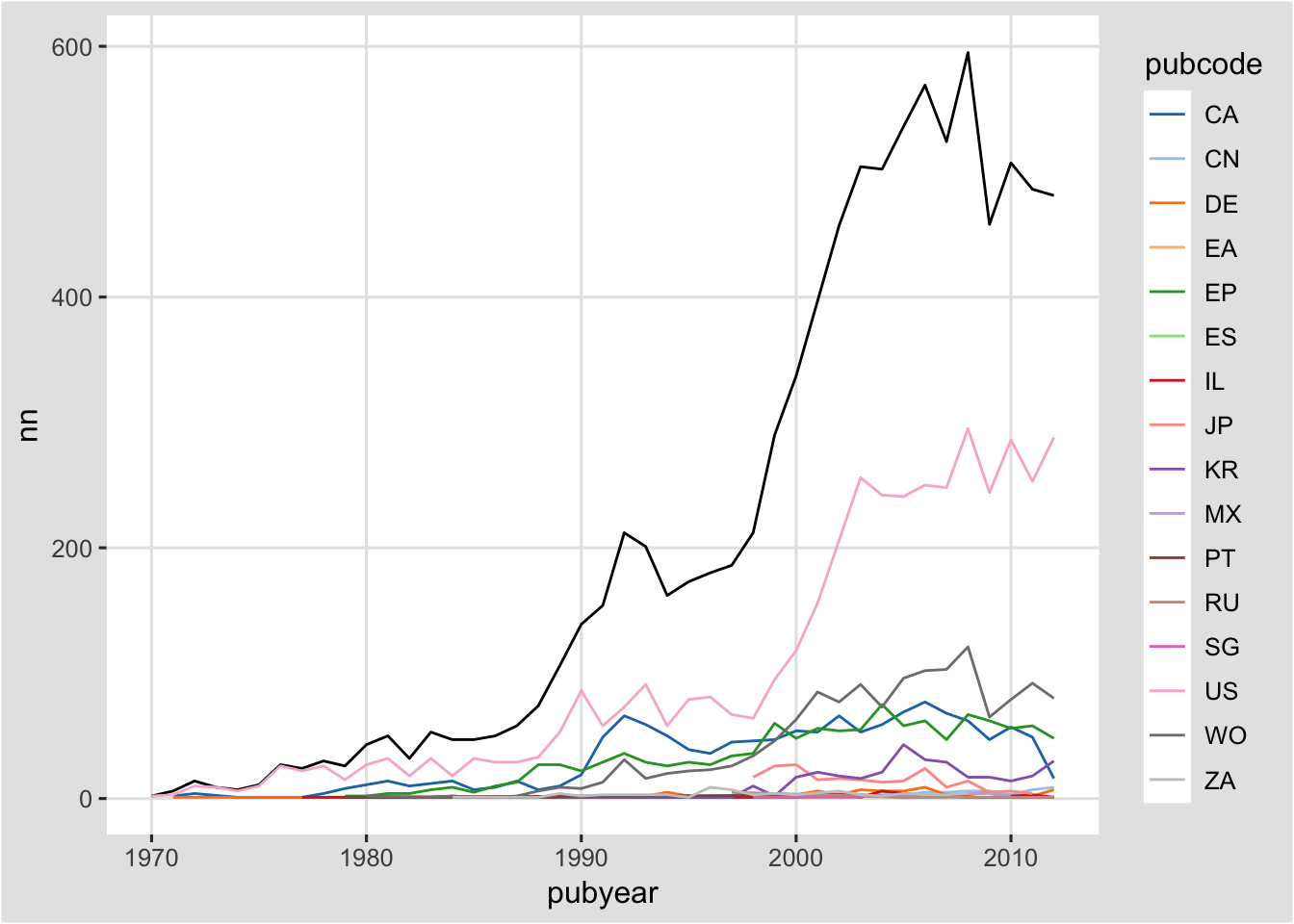
To view the graph type co in the console. Note that we have used pubcode (for the two letter country code), rather than the full country name because the graphic is easier to read.
We could add to this graphic in at least two ways. Let’s try adding a trend line.
###Adding a trend line
What we would like to know here is the trend for pizza patent publications using a regression (see ?geom_smooth() and ?stat_smooth() for further details).
To do that we will work with co as follows by changing geom_line() on the pt data to geom_point() for a scatter plot and then adding a geom_smooth(). By default geom_smooth()
will draw a grey area indicating the standard error interval (se). That interval is set to 0.95 by default. We can do this quite easily by adding geom_smooth() to co.
co + geom_smooth()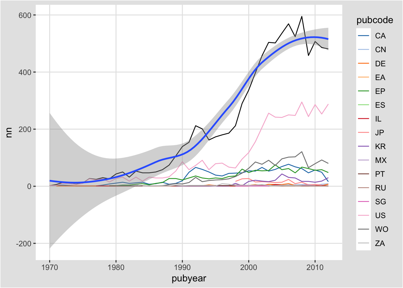
We will now see a message telling us what is happening “geom_smooth: method=”auto" and size of largest group is <1000, so using loess. Use ‘method = x’ to change the smoothing method."
If we leave the standard error interval for the trend line on then our graph becomes hard to understand. We can turn it off we can set an argument inside as follows.
co + geom_smooth(se = FALSE)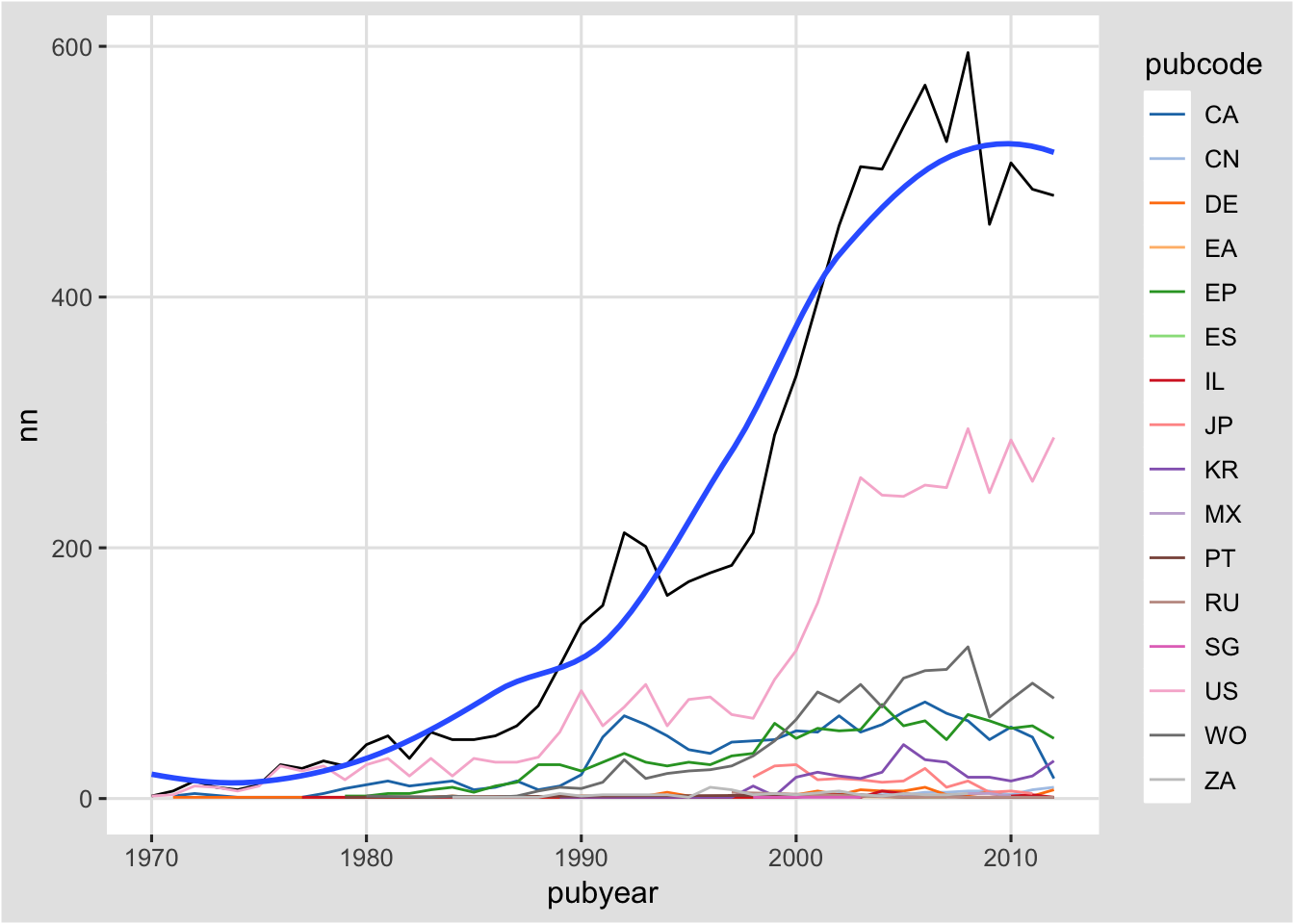
To experiment with an alternative method try + geom_smooth(method = "lm", se = FALSE) for a linear model and look up ?geom_smooth and associated ?stat_smooth. We would of course want to add a label for the trend line but we will come to labels below. Add label
###Statistical Transformations
As this suggests there are a range of statistical transformations available in ggplot2 and some are used in the default settings (such as a bar chart and binwidth). Other options include stat_density(), stat_contour() and stat_quantile() with details listed in ggplot2 under Packages and on the second page of the RStudio Data Visualization cheatsheet.
###Adding Labels
To add labels use the function labs(). Note that the title= , x = and y = must be specified if you want to include labels. Otherwise R will not know what to do with the information.
co + geom_smooth(se = FALSE) +
  labs(title = "Patentscope Pizza Patents",
          x = "Publication Year",
          y = "Publication Count")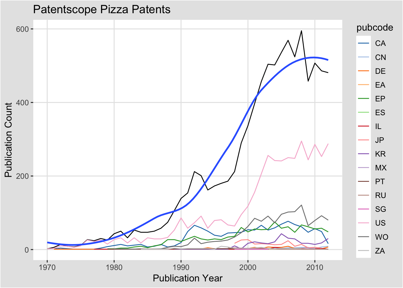

_config.yml
In addition to the general labs argument you can also separately use
- ggtitle(“Patentscope Pizza Patents”) for a main title.
- xlab(“New xlab”) 3. ylab(“New y lab”)
We will go into more detail on legends below.
###Publication Country Charts
To illustrate different types of charts we will now work with the publication country pc data frame that we created earlier.
###A Bar chart
Again first we set the data and aesthetic mappings, specifying the publication country code as the fill (fill with colour) and color as pubcode.
ct <- ggplot(pc, aes(pubcode, weight = nn, fill = pubcode))Next we set the geom, in this case for geom_bar(). Because the x axis will have country code labels we will remove the legend using guides(fill=FALSE). Note that the legend arises from fill=pubcode in the base object. Alternative ways of removing a legend include scale_fill_discrete(guide = FALSE) or theme(legend.position="none").
ct + geom_bar() + guides(fill=FALSE)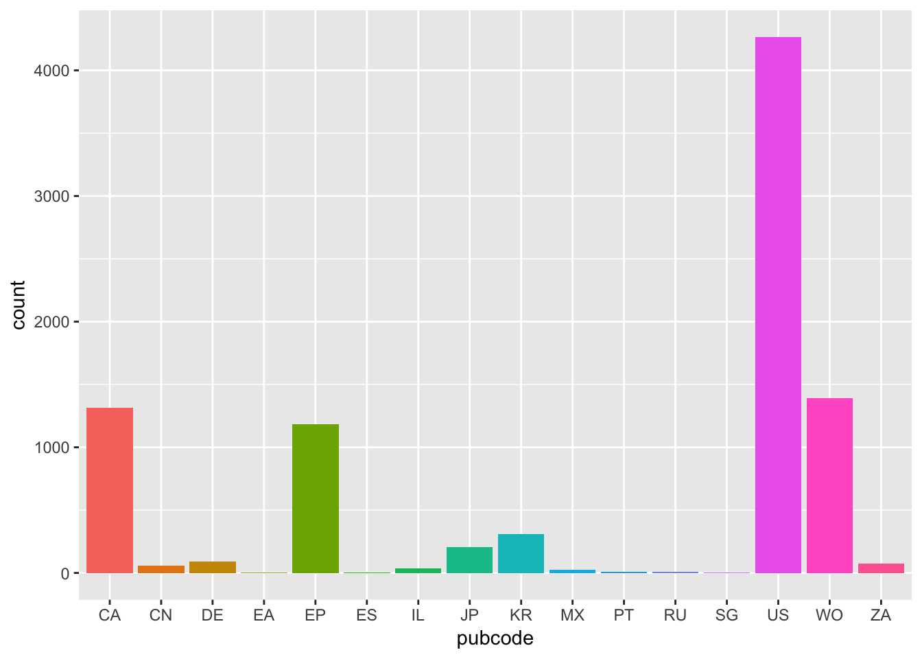
Note here that if we changed fill = pubcode in ct to colour = pubcode then the countries would be outlined with colour. Try this, then select Enter at the end of the line to update the object.
Following Edward Tufte we could also try a simpler approach. To do that we apply theme_tufte() from ggthemes and change the font to Helvetica, or something other than the default Serif in this theme, by specifying the base_family.
ct1 <- ct + geom_bar() +
  theme_tufte(base_family = "Helvetica") +
  guides(fill=FALSE)
ct1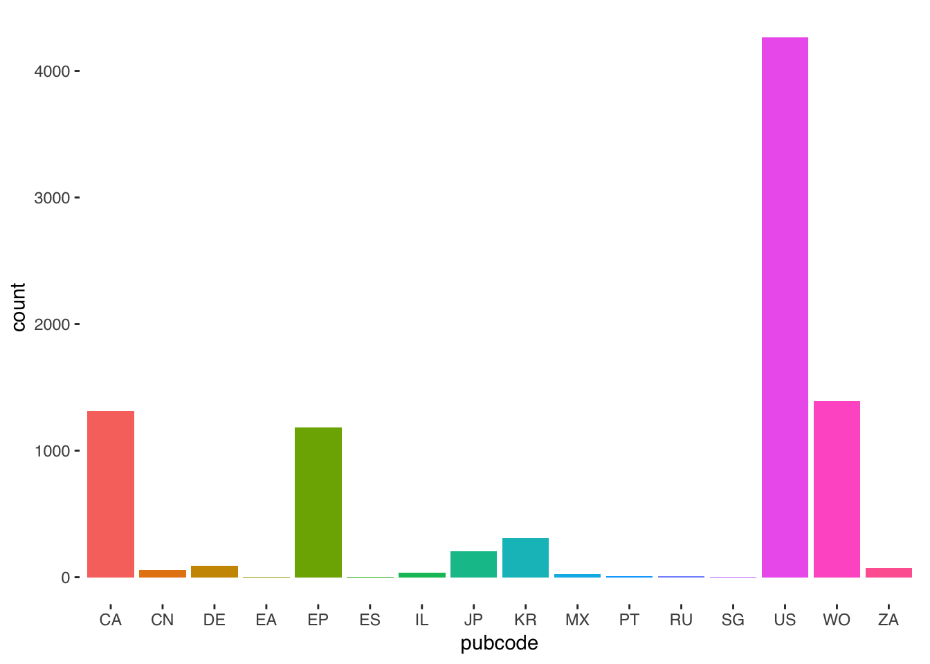
This is a nice simple example of removing clutter to focus in on what matters: presenting the data. We can also apply the tableau theme for consistency with our trends plots. In this case we will use theme(legend.position="none") to turn off the legend.
ct2 <- ct + geom_bar() +
  theme_igray() +
  scale_color_tableau("tableau20") +
  theme(legend.position="none")
ct2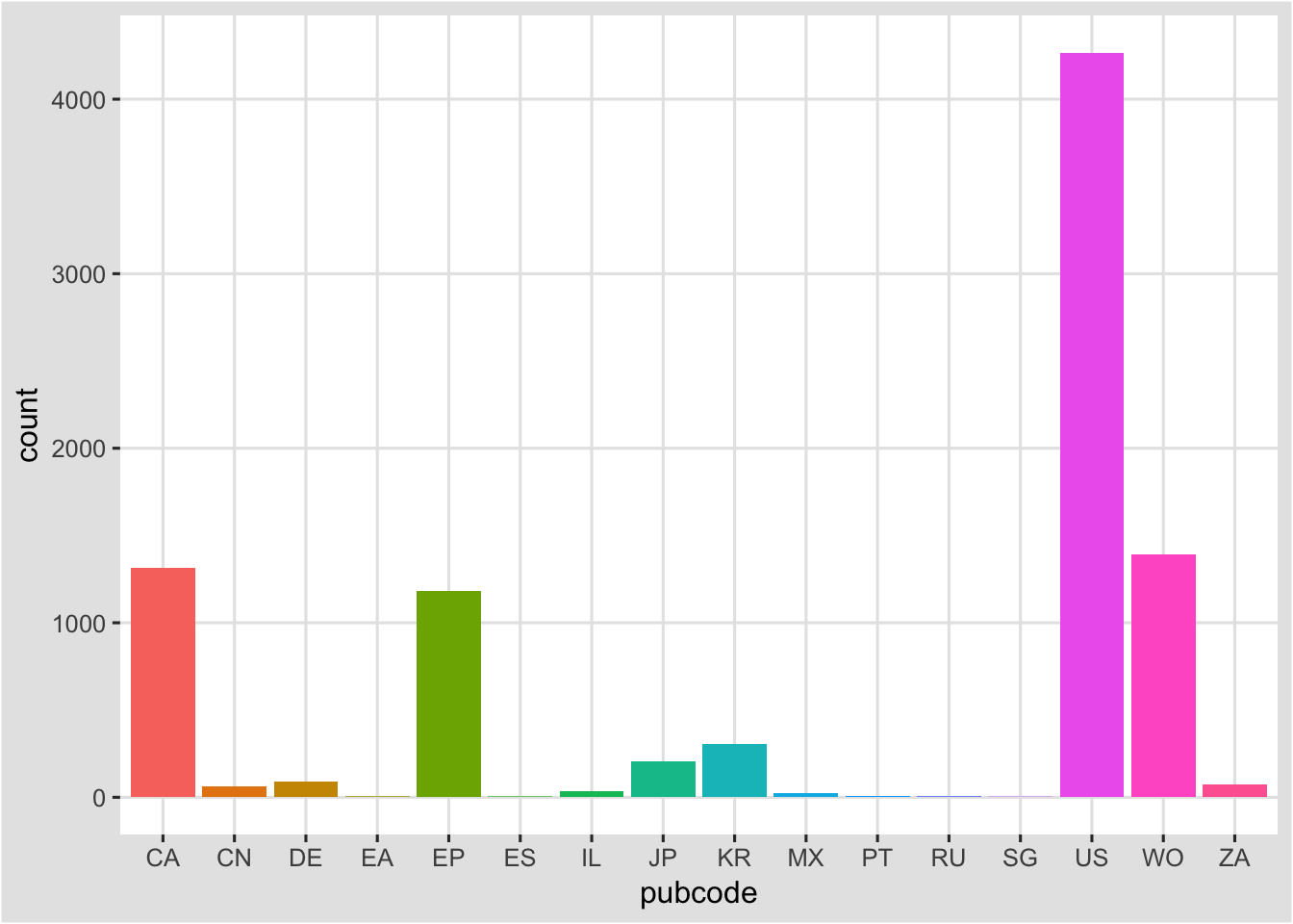
A range of other options for controlling fonts and legends with practical demonstrations can be found on Winston Chang’s R Graphics Cookbook website. Adjusting line weight and backgrounds can contribute to bringing data to the fore while minimising noise and what Tufte in The Visualisation of Quantitative Information called “chart junk”.
###Adding labels to columns
We can also add the values to our bars for our new object . We can achieve this using geom_text. In this case we needed to specify the y axis again inside geom_text. vjust specifies the vertical justification with the horizontal being hjust. In this case we have also specified the font size in geom_text() as 12.
ct2 + geom_text(aes(y = nn, label = nn, size = 12), vjust= -0.2)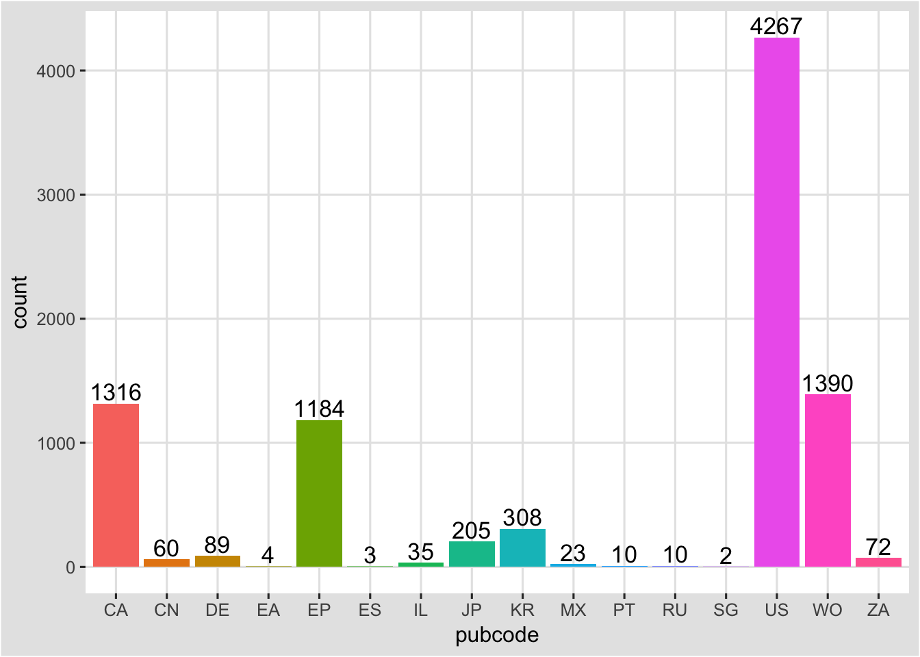
If we wanted to make this more closely resemble the country count chart from our earlier Tableau workbook (a stacked horizontal bar chart) we would need to swap around the axes. To do that we add coord_flip() to flip around x and y and then we adjust the labelling to use hjust for horizontal justification rather than vjust.
To create the ranked bar we need to use the function reorder() with either the x or the y axis. In this case it is the x axis. We need to specify both x and the y inside reorder() for this to work. In other cases you may need to go back to your original data table to adjust the data.
Depending on the font used you may have to change the hjust value or adjust the font size. Note that only the first four lines are essential to this code. The remainder are for our tableau theme and to hide the legend.
###A Ranked Bar Chart
ctr <- ggplot(pc, aes(x = reorder(pubcode, nn), y = nn, fill = pubcode)) +
  geom_bar(stat = "identity") +
  coord_flip() +
  geom_text(aes(y = nn, label = nn, size = 12), hjust = -0.1) +
  theme_igray() +
  scale_color_tableau("tableau20") +
  theme(legend.position="none") +
  labs(title="Patentscope Pizza Patents", x = "Publication Country", y = "Publication Count")
ctr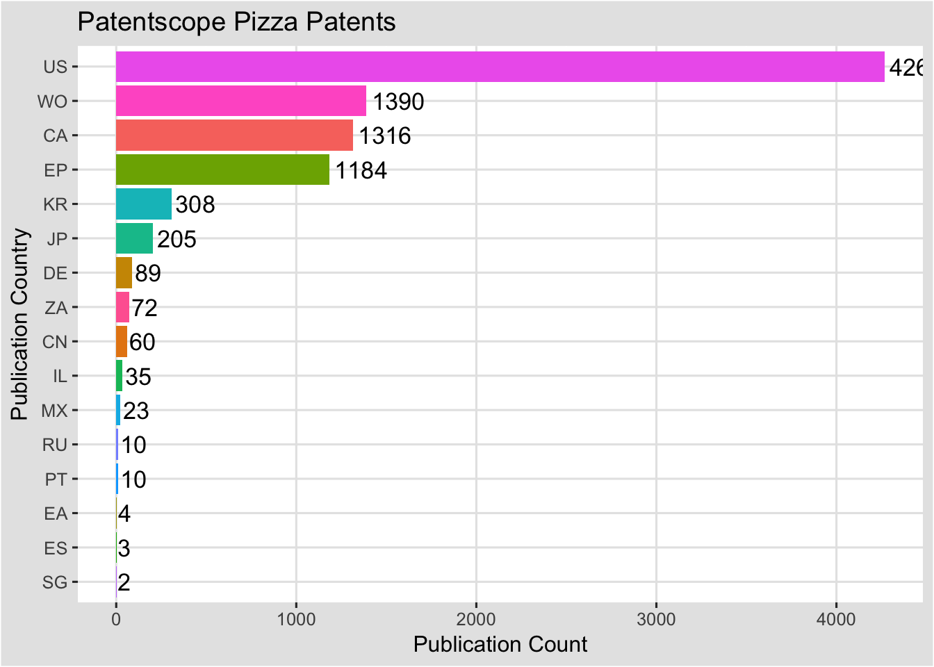
There is room for improvement here, such as the colour of the country names (or replacing them with actual names) and adjusting the font size to more closely match the axis fonts. It can also be tricky to ensure that the highest value (in this case the label for the US) stays inside the plot. However, it is pretty close. Turning now to our patent country year table pcr we will look at some other chart forms and coordinate systems.
###A Dot Plot
For a simple dot plot of the same data we can make three changes. 1. We change fill to colour in the base object. 2. We change geom_bar to geom_point and specify the size of the dots. 3. For the labelled values we change hjust.
ctd <- ggplot(pc, aes(x = reorder(pubcode, nn), y = nn, colour = pubcode)) +
  geom_point(size = 3) +
  coord_flip() +
  geom_text(aes(y = nn, label = nn, size = 12), hjust = -0.4) +
  theme_igray() +
  scale_color_tableau("tableau20") +
  theme(legend.position="none") +
  labs(title="Patentscope Pizza Patents", x = "Publication Country", y = "Publication Count")
ctd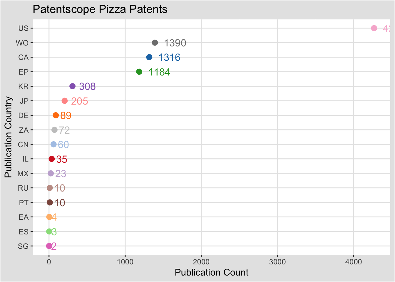
Note here that one limitation of this dot plot is the adjustment of hjust where smaller numbers appear closer to the dots than larger numbers. This suggests a need for experimentation with hjust and possibly the size and assessing whether to retain the labels. Options for recolouring labels might also be considered.
###A Balloon Plot
Another way or representing the data would be as a set of balloons sized on the number of records.
ctb <- ggplot(pc, aes(x = pubcode, y = nn, size = nn)) +
  geom_point(shape = 21, colour = "black", fill = "cornsilk") +
  scale_size_area(max_size = 15) +
  theme_igray() +
  scale_color_tableau("tableau20") +
  theme(legend.position="none") +
  labs(title="Patentscope Pizza Patents", x = "Publication Country", y = "Publication Count")
ctb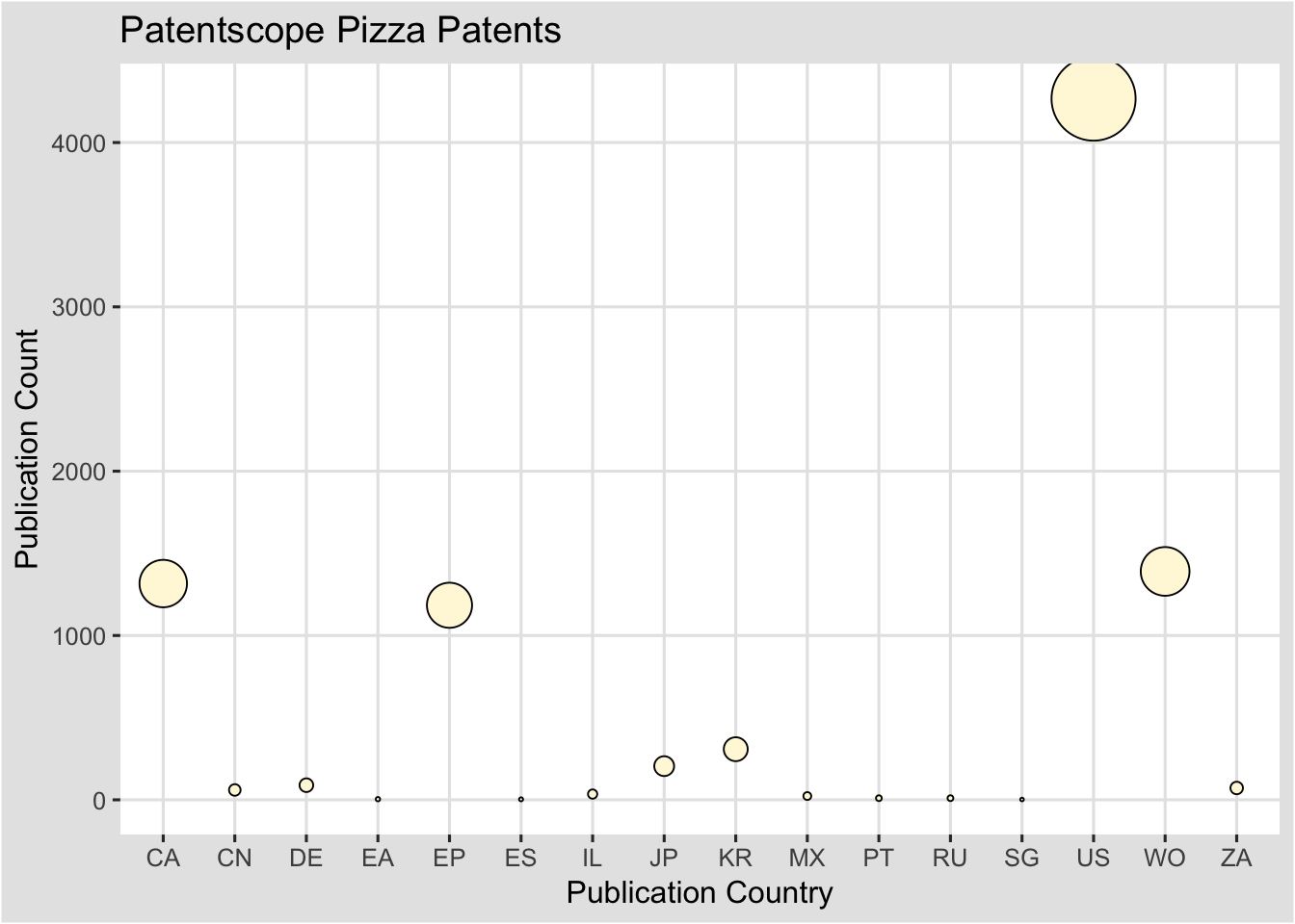
This is a very basic balloon plot and plots of this type could be readily adapted to represent a wide variety of patent data.
###A Stacked Bar Chart
To create a stacked bar chart using our pcy data we can use the following. We will however rapidly run into some of the aesthetic problems that are common with stacked bar charts. In reading this section, consider whether a stacked bar chart is really the best way to represent the data.
sb <- ggplot(pcy, aes(pubyear, weight = nn, fill = pubcode)) +
  geom_bar(binwidth = 1)
sb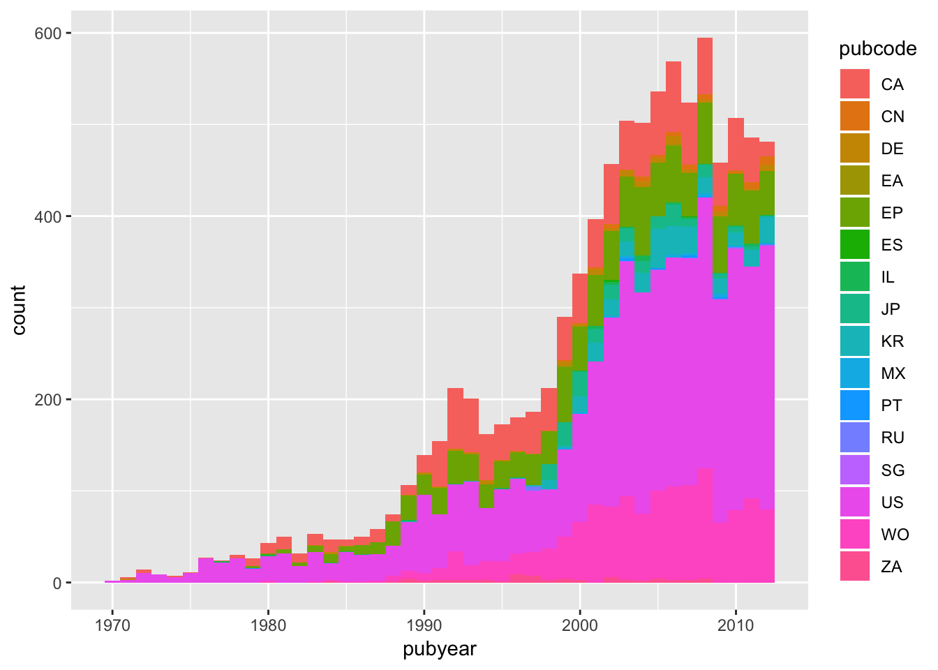
In practice a filled graph of this type could reasonably be described as a mess. This arises from the number of countries involved and the default colors. It is in fact less clear than the line plot by country created above. Stacked plots also suffer from problems with the order of the data and the legend. That is, as we saw above, simpler is generally better in conveying information.
It is not a good idea to attempt to prettify a bad graph because it will still be a bad graph. Indeed we encounter multiple issues if we attempt to improve this stacked bar. We will illustrate this with the main table we created earlier.
sm <- ggplot(main, aes(pubyear, weight = nn, fill = pubcode))- Adding a colour border.
We are presently using fill on the pubcode, but what if we specified a colour for the borders of the data.
sm + geom_bar(binwidth = 1, colour = "black")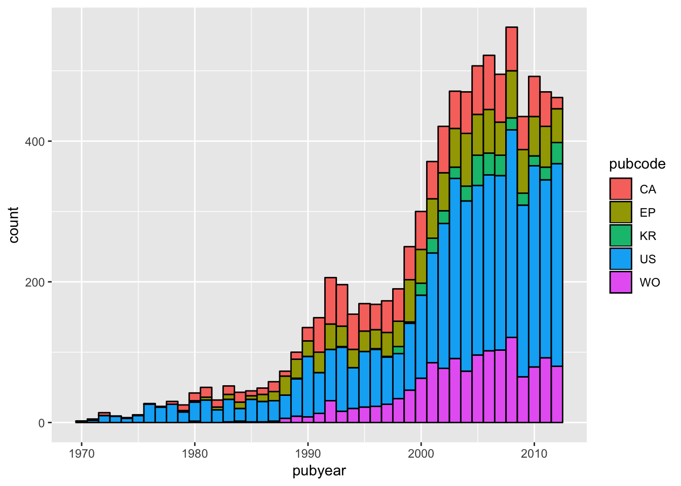
- The order of the bars
The addition of the colour outline is an improvement but the order of the stacked bars is not correct. We can attempt to adjust for this with a quick use of arrange
main <- arrange(main, pubcode)A definite improvement but not earth shattering and we now have a filled legend. We can try changing the palette.
sm + geom_bar(binwidth=1, colour="black") +
  theme_igray() +
  scale_fill_tableau("tableau20")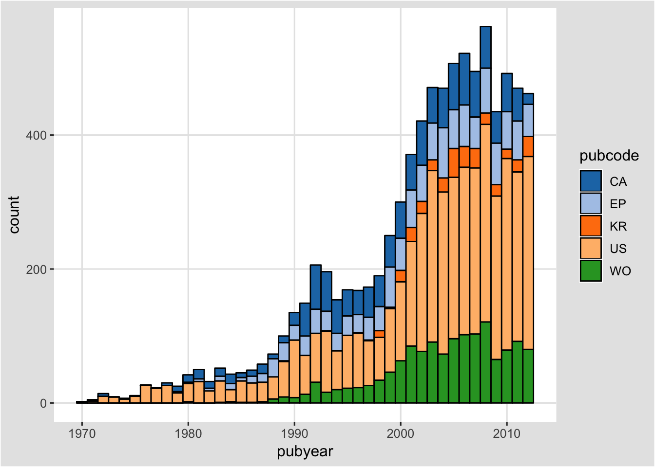
We can also start to work on the line colour and the line weight in the function to try to clarify the plot.
sm + geom_bar(binwidth = 1, colour = "gray", size = .25) +
  theme_igray(base_family = "Helvetica") +
  scale_fill_tableau("tableau20")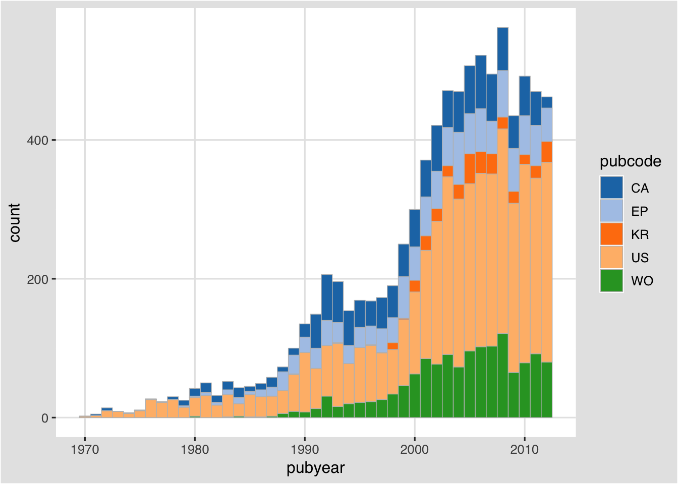
That is an improvement of sorts. We could then do the same for the other tables while noting that a means will be needed to ensure that different colours are used on the countries across the summary plots.
As this suggests stacked bar charts present communication difficulties. That is they take quite a lot of work to get right and the ultimate result may still be difficult for a reader to interpret.
We could try this as a stacked area graph as follows.
sm <- ggplot(main, aes(pubyear, y = nn, fill = pubcode, order = pubcode)) +
   geom_area() +
   theme_igray(base_family = "Helvetica") +
   scale_fill_tableau("tableau20")
sm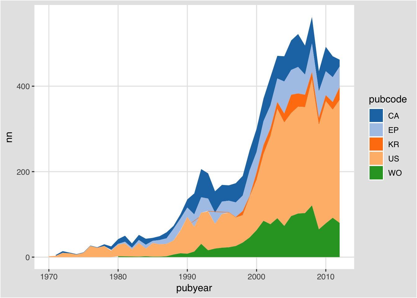
That looks promising but note that the order of the stack is not correct and can give a misleading impression. Thus the order should be descending from US, WO, CA, EP, KR. At the time of writing an easy way of adjusting this has not been identified. As such, significant energy could be expended attempting to improve what is essentially a bad graph.
###Faceting
One of the problems we commonly encounter in patent analysis is that data is compressed by dominant players, whether these be countries, applicants or technology areas. One important approach to addressing this problem is to break the data out into multiple individual plots by faceting that data. The term faceting in ggplot is perhaps more familiar as the creation of trellis graphs.
To facet our publication by country and year data from the graph above we will start by creating an object with the information below. We will leave out labels. We will however add a control that excludes the legend because it will be redundant and get in the way of the large plot we will be creating.
f <- ggplot(pcy, aes(x = pubyear, y = nn, color = pubcode)) +
  geom_point() +
  theme_igray(base_family = "Helvetica") +
  scale_fill_tableau("tableau20") +
  theme(legend.position="none")
The key to creating the facet plot is selecting:
- the right faceting option (either
facet_gridorfacet_wrap) - the variable to facet on which is specified using tilde
~in the function e.g~pubcodeto facet only on pubcode orpubcode~groupfor both pubcode and group.
For demonstration we will walk through some options:
If we choose facet_grid we will see a line of plots. The main issue that arises here is adjusting the labelling on the x axis. We can do that by adding scale_x_continuous and specifying the breaks and values we want to see. We could also as needed change the labels by adding to the function like this scale_x_continuous(breaks = c(1970, 2010), labels = c(label1, label2)).
f + facet_grid(~pubcode, shrink = TRUE) +
  scale_x_continuous(breaks = c(1970, 2010))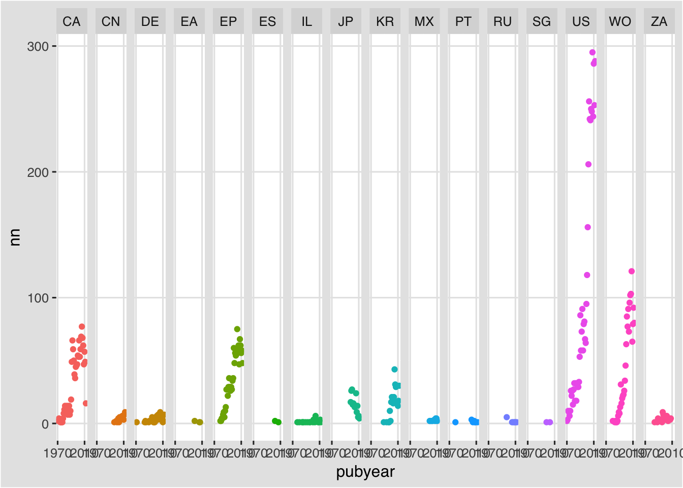
However, the above plot suffers from being too vertical and the labels remain squashed. In future it may be possible to adjust this (using + theme(panel.margin.x = unit(5, "lines") but at the time of writing this did not appear to be working) (see this Stackoverflow discussion.
An alternative option for a clearer plot might be to use the groups that we created in the data table to facet on.
f + facet_grid(pubcode~group, shrink = TRUE) +
  theme(legend.position = "none") +
  scale_x_continuous(breaks = c(1970, 2010))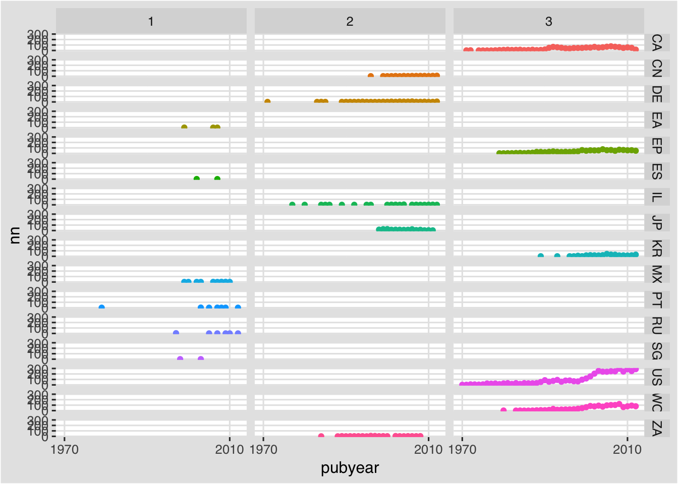
That is an improvement, as we can see the three groups, but note that the countries are ordered alphabetically rather than by group.
###facet_wrap
To create a more reasonable plot we can use facet_wrap(). Note that the position of the group has been reversed to group~pubcode to achieve this plot.
f + facet_wrap(group~pubcode) +
  theme(legend.position = "none")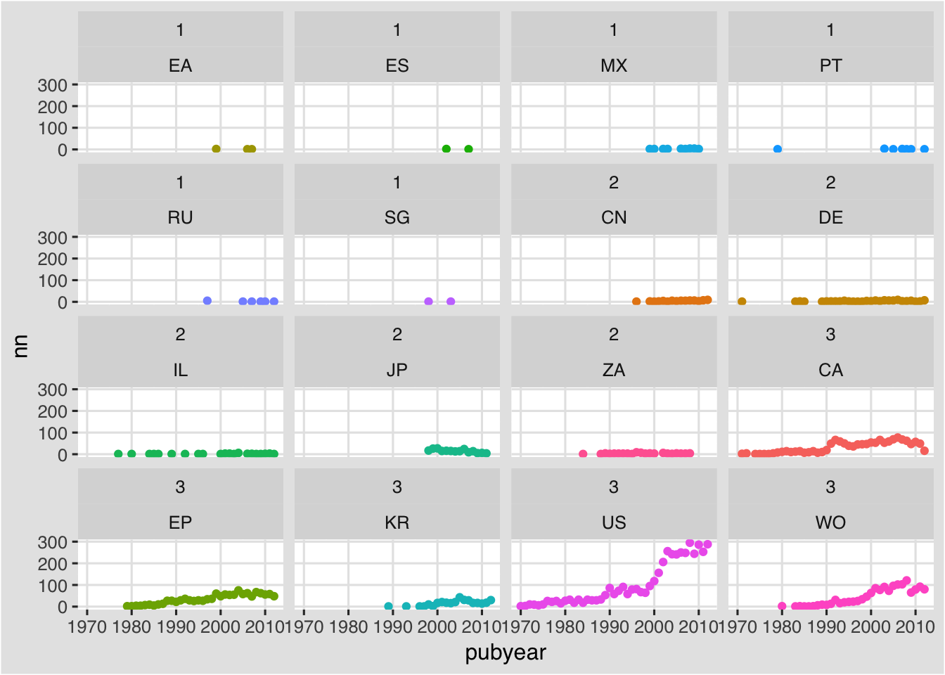
What we now see is a facet plot that is ordered from group 1 to group 3. This is pretty good.
While we would generally want to drop some of the smallest values, to improve this type of plot we might try freeing up the scales. In this case we focus on the y axis by specifying free_y with the alternative being free_x.
f + facet_wrap(group~pubcode, scales ="free_y") +
  theme(legend.position = "none")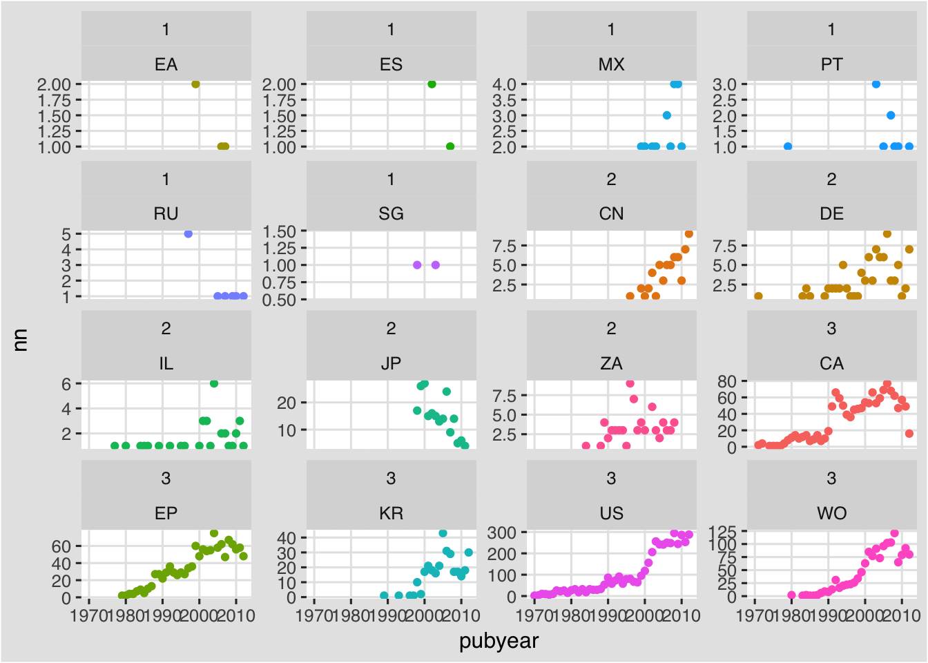
This removes the compression and gives each individual plot its own scale. The default for facets is to show the highest values at the bottom right (the default of argument as.table). If we specify as.table = FALSE the facets will show the higher values (in group 3) first. This might improve the plot.
f + facet_wrap(group~pubcode, scales ="free_y", as.table = FALSE) +
  theme(legend.position = "none")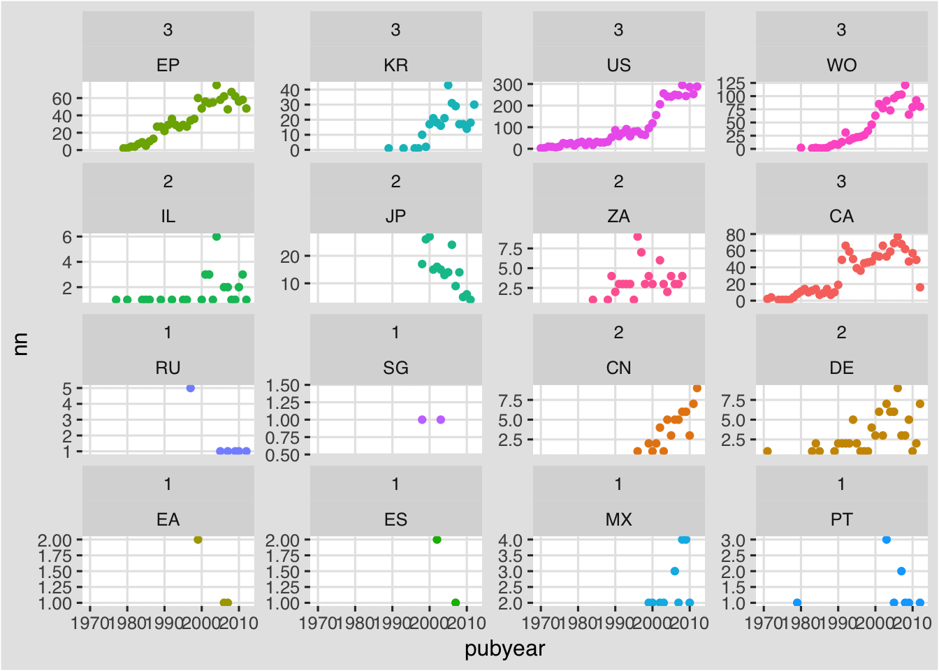
Note that this still presents some problems as ideally the highest value (the US) would appear first and then read in descending order across from left to right. There appear to be some limitations to the controls possible in facet_wrap and also our data structure.
We will revert to the ascending order but keep the free y axis. We could if we wished add a regression to show the trend by country by adding geom_smooth(). We will remove the standard error area by specifying se = FALSE.
f + facet_wrap(group~pubcode, scales ="free_y", as.table = TRUE) +
  geom_smooth(se = FALSE) +
  theme(legend.position = "none")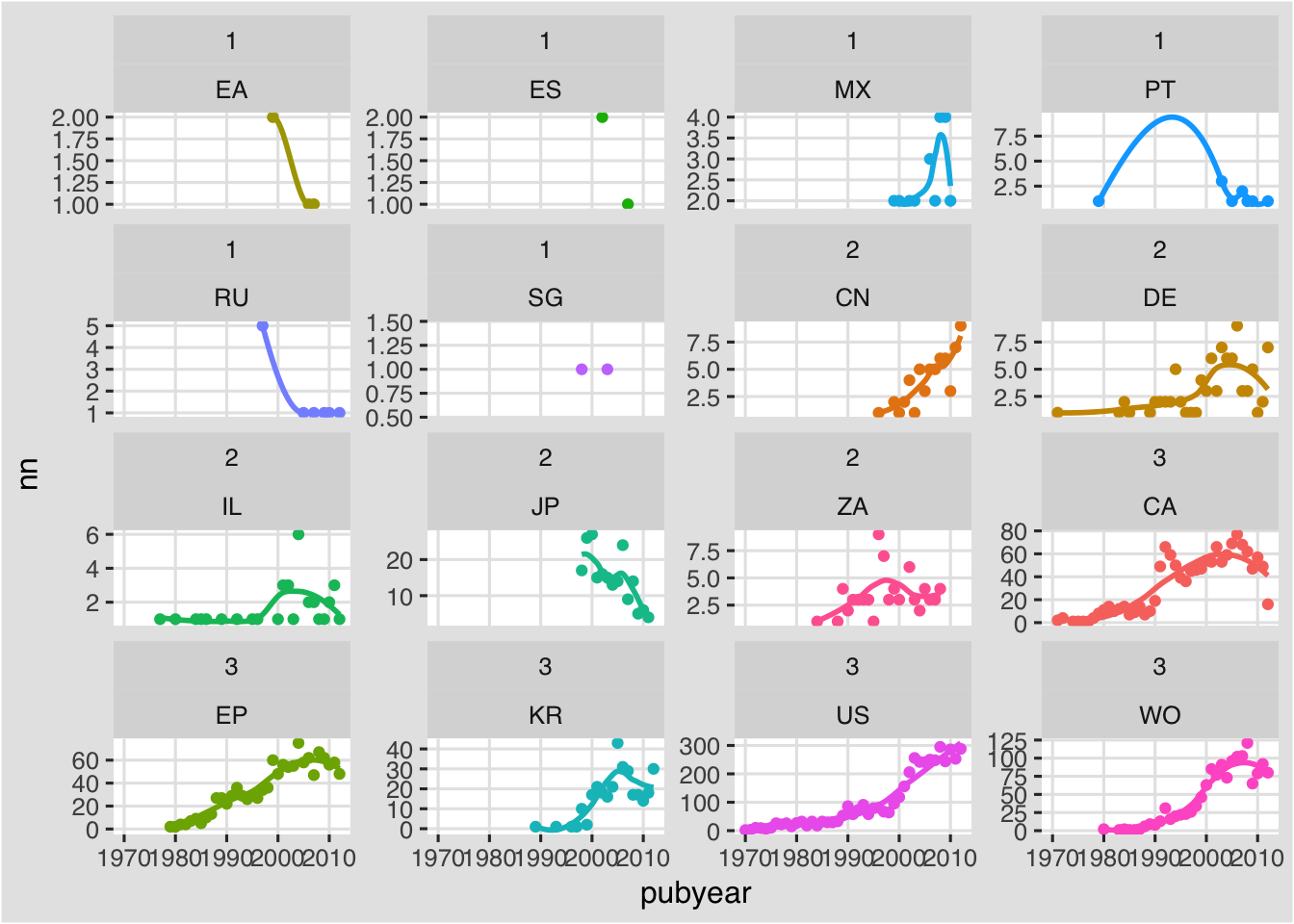
In running this code we will receive a message for each plot informing us of the smoothing method that is being used.
The issue we encounter here is that a number of countries in group 1 and group 2 have very sparse results with no corresponding meaningful trend to display. In practice we would drop group 1 entirely and focus on group 2 and 3. To conclude, let’s do that.
g <- filter(pcy, group %in% c(2,3))The %in% within filter basically says “extract rows falling into group 2 or 3 from within group”. Once again it is a simple dplyr solution and easy to remember.
g1 <- ggplot(g, aes(x = pubyear, y = nn, color = pubcode)) +
  geom_point() +
  theme_igray(base_family = "Helvetica") +
  scale_fill_tableau("tableau20")
We can now try again with our trend line using geom_smooth.
g1 + facet_wrap(group~pubcode, scales ="free_y", as.table = TRUE) +
  geom_smooth(se = FALSE) +
  theme(legend.position = "none")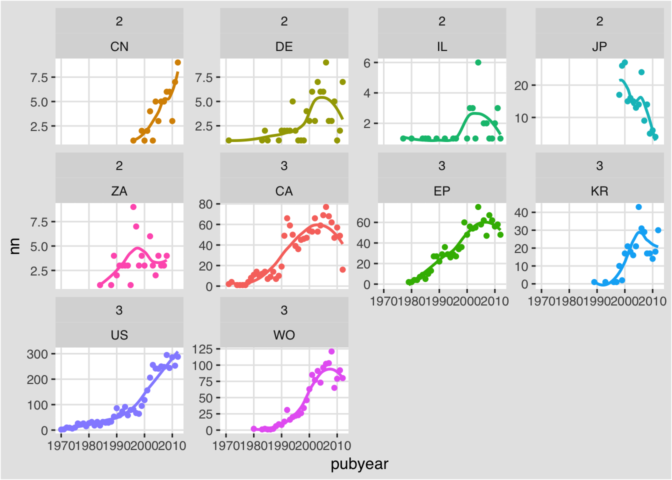
That is a considerable improvement and we will stop there. One limitation of facet wrap is that it appears that renaming the labels, to leave only the country codes, is not possible (although using labeller may provides solutions). It may also be the case that we would prefer to drop some of the other countries with low scores from group 2. We could do that by applying a filter on pubcode. We could also add some labels to the overall plot.
##Pie and Coxcomb Plots
Creating a Pie Chart (aaaargh)
A pie chart is the plan view of a stacked bar chart using polar coordinates. Pie charts of the familiar variety are widely criticised because they are hard to accurately interpret. They also tend to become laden with what Edward Tufte called “chart junk”, such as 3D rendering, that distracts from the presentation and communication of the data. Edward Tufte has this to say about pie charts in The Visual Display of Quantitative Information:
“A table is nearly always better than a dumb pie chart; the only worse design than a pie chart is several of them, for then the viewer is asked to compare quantities located in spatial disarray both within and between pies… Given their low data-density and failure to order numbers along a visual dimension, pie charts should never be used.”(Tufte 2001: 178)
However, Tufte’s criticism has done relatively little to diminish the popularity of the pie chart and it seems, almost everyone knows what a pie chart is.
Creating a pie chart in ggplot takes some thought. As is often the case when working with R we can find a detailed walk through in the wider user community. In this case we are following the code developed by the Mathematical Coffee blog entitled ggpie: pie graphs in ggplot2. For those familiar with R, Mathematical Coffee wraps this into a function called for generating pie charts. We will walk through the steps from the blog post and adapt it to our pizza data.
The first step is to create an object as a stacked chart. In this case we attribute a single value to the x axis, specify the y axis as percent and then the fill as publication code. This creates a stacked bar chart.
o1 <- ggplot(pc, aes(x=1, y = percent, fill = pubcode)) + geom_bar(stat = "identity")
o1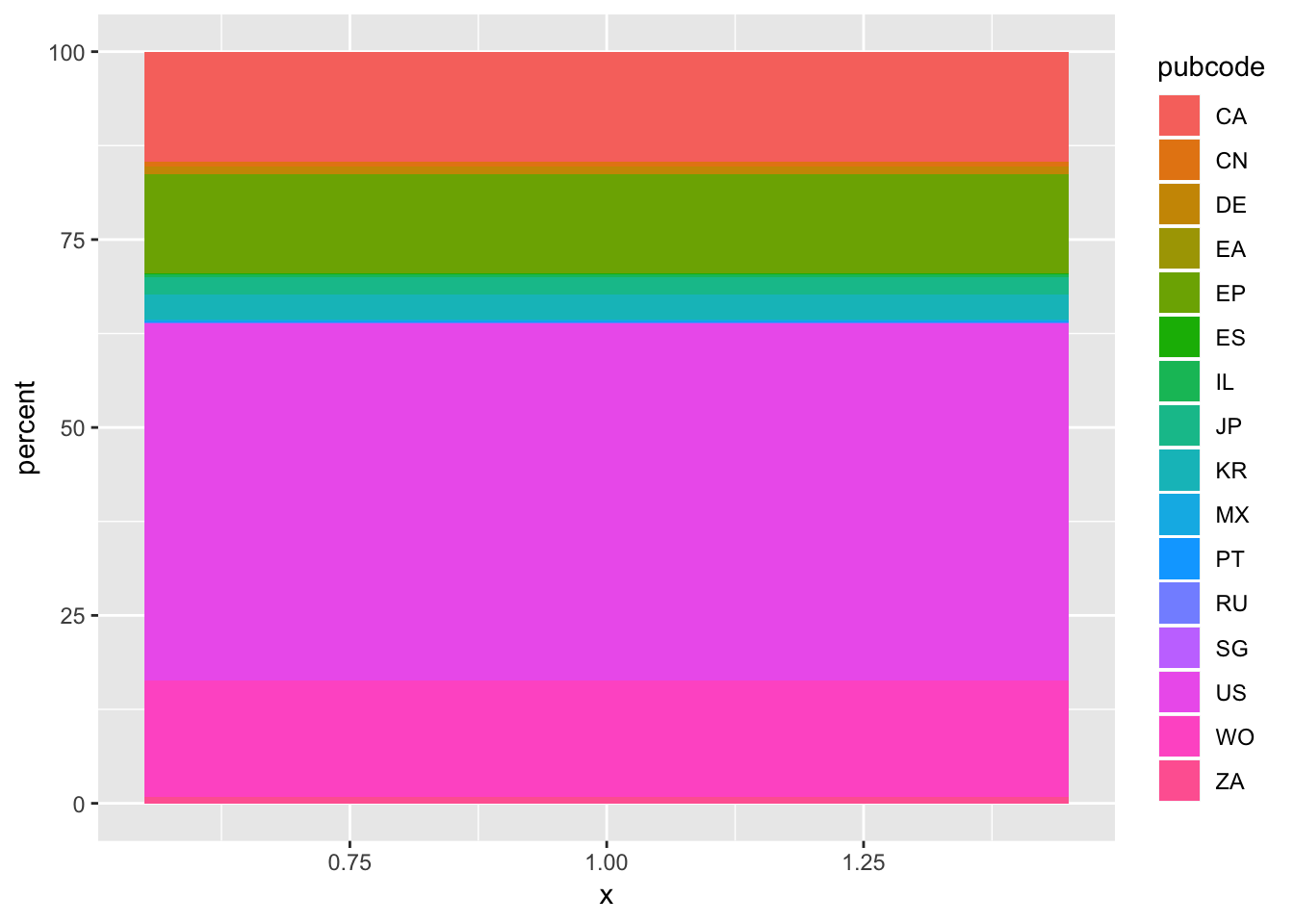
If we view this it will be a stacked bar. In the second step we create the pie chart by specifying the polar coordinate and theta = y.
y <- o1 + coord_polar(theta = "y")If we now enter y in the console we will see a pie chart. The remaining steps involve further defining the aesthetics of the chart, tidying up and adding labels.
The following adds black lines to define the pie segments. Because these lines are then reflected in the legend the argument overrides this by using colour = NA.
z <- y + geom_bar(stat = "identity", colour = "black") +
  guides(fill=guide_legend(override.aes=list(colour=NA)))
z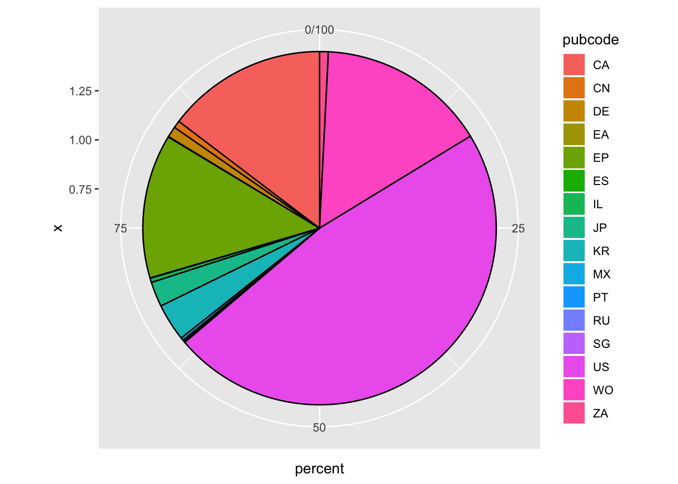
Then remove the various tick marks
z <- z +
    theme(axis.ticks=element_blank(),
          axis.title=element_blank(),
          axis.text.y=element_blank()
          )
z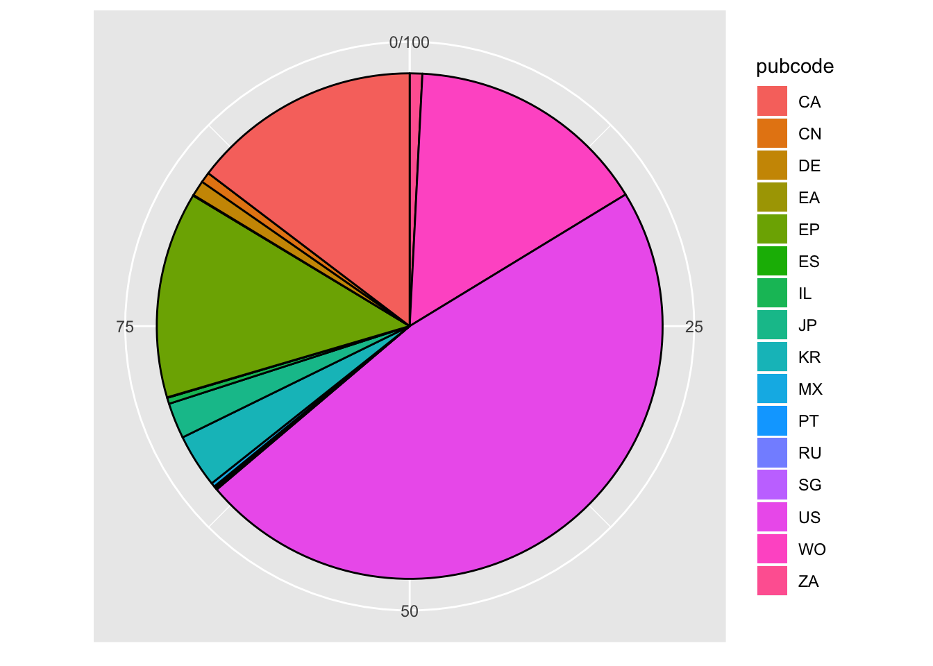
We need to work out the position of the labels that we would like to see on the pie, and in particular the mid-point of each pie. This can be found as the cumulative sum cumsum of the variable we used for the slices. That is percent expressed as pc$percent to state the data frame and the column we want in the percent table.
y.breaks <- cumsum(pc$percent) - pc$percent/2If we print y.breaks to the console we will a list of values.
q <- z +
    theme(axis.text.x=element_text(color='black')) +
    scale_y_continuous(
        breaks=y.breaks,
        labels=pc$pubcode)
q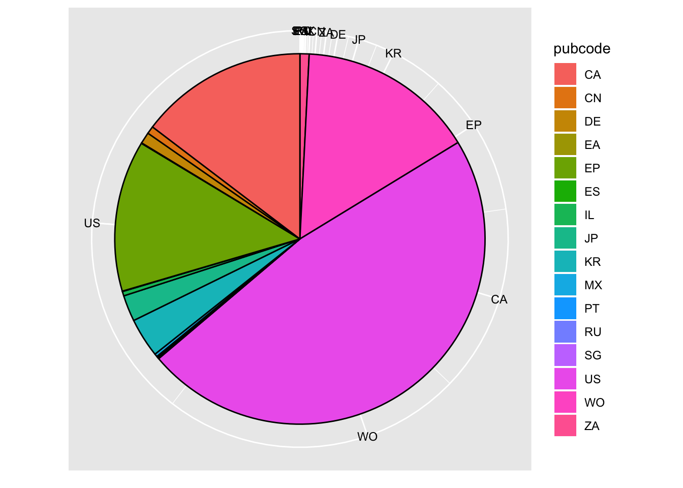
Thanks to Mathematical Coffee we now have a functional pie chart of the percentage share of pizza patent documents. The only issue with this plot is that some of the labels on the smaller values are crunched. That could however be addressed by filtering rows in accordance with the groups on the pc table, as we did above for pcy, to remove the overlap.
###The Coxcomb Plot
A coxcomb plot is generally associated with Florence Nightingales representation of the causes of mortality among the British Army in the Korean War that can be viewed here.
A coxcomb plot begins with a bar chart as follows. Note that we have chosen n for the y value from the table. We could have used percent.
We will use a filtered version of the table that only contains group 3 results.
cx <- filter(pc, group %in% 3)We start the plot by creating a bar chart. Note that we are using the value of n here for the y axis. This could be changed to percent or another value as needed.
cx1 <- ggplot(cx, aes(x = pubcode, y = nn, fill= pubcode)) +
  geom_bar(stat="identity")
cx1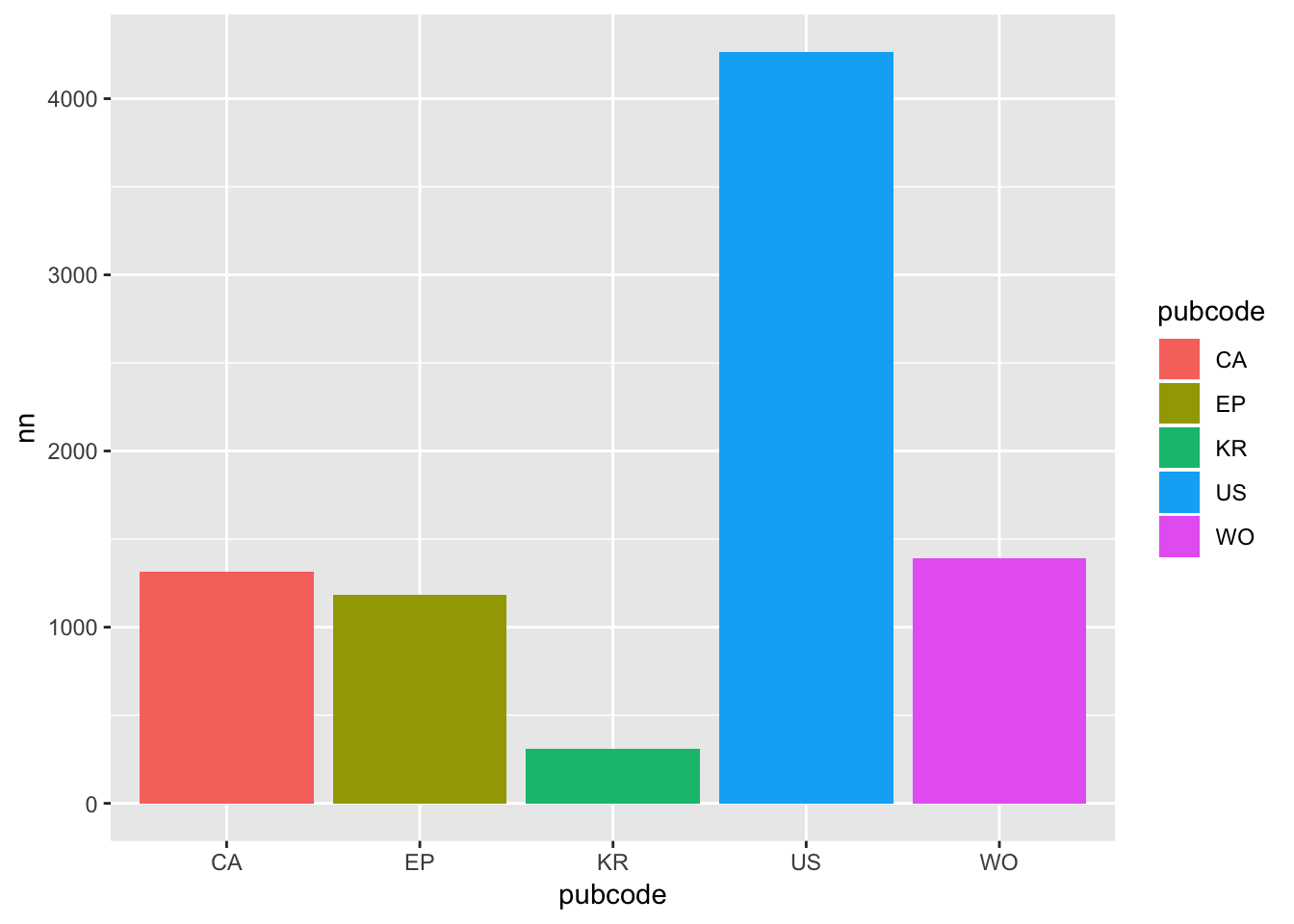
We them add a coord_polar specifying theta in this case as x (the pubcode). The remainder of the code is thematic.
cx1 + coord_polar(theta="x") +
   theme_light() +
   theme(legend.position="none") +
   labs(x = "Publication Country", y = "Publication Count",
        title  = "Pizza Patent Publications by Country")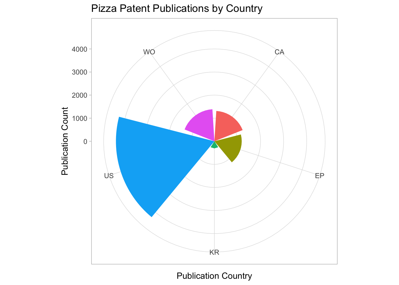
In the R Graphics Cookbook, Winston Chang adds three observations about coxcomb plots. The first is that for y variables the smallest value is mapped to the centre of the plot, rather than a data value of 0 being mapped to a radius of 0. Second, for a continuous x (or theta) the smallest and largest values are merged. Third, theta values of polar coordinates do not wrap around. As such changes would need to be made to the limits of the plot (see Chang 2013: 200-203 for discussion).
##Round Up
In this article we have covered two main topics.
- How to prepare data for graphing in R using the
dplyrpackage. - How to draw a range of graphs and the issues encountered using ggplot2.
In this article we have not explored the full potential of visualisation options in ggplot2, such as heat maps and choropleth maps. These topics are regularly covered on sites such as r-bloggers.com. However, we have seen that it is possible to construct graphics from the bottom up using simple code and specifying the details we would like to see.
We have seen that the great strength of ggplot2 is the ability to control all aspects of a graphic. However, in working with our sample data we have also seen that this can lead to complexity in terms of adjusting data such as arranging or labelling. While it will be possible to bundle the code into functions that could be reused, it is equally clear that significant time investments are involved in working towards publication quality graphics using ggplot2. Those time demands will diminish with improved familiarity but are nevertheless a significant factor.
To go further with ggplot2 we provide a list of resources below. We also suggest installing R tutorials such as (install.packages(“swirl”)) and learning more about the use of pipes in dplyr.
##Useful Resources
- RStudio Cheatsheet
- R Graphics Cookbook by Winston Chang
- Hadley Wickham 2010 A Layered Grammar of Graphics preprint article
- Hadley Wickham ggplot2 book from Amazon
- Swirl tutorials (install.packages(“swirl”)) and Github repository
- ggplot2 online help topics
- R-Bloggers on ggplot2
- Stack Overflow questions and answers on ggplot2
- YouTube ggplot 2 videos
- Mathematical Coffee Blog Post on Creating a Pie Chart with ggplot2 an the ggpie code