This is the first part of a two part article on using R and the ggplot2 package to visualise patent data. In a previous article we looked at visualising pizza related patent activity in Tableau Public. In this article we look at how to wrangle our pizza dataset using dplyr package in RStudio to prepare the data for graphing. This is intended as a gentle introduction and you do not need to know anything about R to follow this article. You will however need to install RStudio Desktop for your operating system (see below).
Part 1 will introduce the basics of handling data in R in preparation for plotting and will then use the quick plot or qplot function in ggplot2 to start graphing elements of the pizza patents dataset.
Part 2 will go into more depth on handling data in R and the use of ggplot2.
ggplot2 is an implementation of the theory behind the Grammar of Graphics. The theory was originally developed by Leland Wilkinson and reinterpreted with considerable success by Hadley Wickham at Rice University and RStudio. The basic idea behind the Grammar of Graphics is that any statistical graphic can be built using a set of simple layers consisting of:
- A dataset containing the data we want to see (e.g x and y axes and data points)
- A geometric object (or
geom) that defines the form we want to see (points, lines, shapes etc.) known as ageom. Multiplegeomscan be used to build a graphic (e.g, points and lines etc.). - A coordinate system (e.g. a grid, a map etc.).
On top of these three basic components, the grammar includes statistical transformations (or stats) describing the statistics to be applied to the data to create a bar chart or trend line. The grammar also describes the use of faceting (trellising) to break a dataset down into smaller components (see Part 2).
A very useful article explaining this approach is Hadley Wickham’s 2010 A Layered Grammar of Graphics (preprint) and is recommended reading.
The power of this approach is that it allows us to build complex graphs from simple layers while being able to control each element and understand what is happening. One way to think of this is as stripping back a graph to its basic elements and allowing you to decide what each element (layer) should contain and look like. In short, you get to decide what your graphs look like.
ggplot2 contains two main functions:
- qplot (quick plot)
- ggplot()
The main difference between the two is that quick plot makes assumptions for you and, as the name suggests, is used for quick plots. In contrast, with ggplot we build graphics from scratch with helpful defaults that give us full control over what we see.
In this article we will start with qplot and increasingly merge into developing plots by adding layers in what could be called a ggplot kind of way. We will develop that further in the Part 2.
Getting Started with R
This article assumes that you are new to using R. You do not need any knowledge of programming in R to follow this article. While you don’t need to know anything about R to follow the article, you may find it helpful to know that :
- R is a statistical programming language. That can sound a bit intimidating. However, R can handle lots of other tasks a patent analyst might need such as cleaning and tidying data or text mining. This makes it a good choice for a patent analyst.
- R works using packages (libraries) for performing tasks such as importing files, manipulating files and graphics. There are around 6,819 packages and they are open source (mainly it seems under the MIT licence). If you can think of it there is probably a package that meets (or almost meets) your analysis needs.
- Packages contain functions that do things such as
read_csv()to read in a comma separated file. - The functions take arguments that tell them what you want to do, such as specifying the data to graph and the x and y axis e.g. qplot(x = , y = , data = my dataset).
- If you want to learn more, or get stuck, there are a huge number of resources and free courses out there and RStudio lists some of the main resources on their website here. With R you are never alone.
R is best learned by doing. The main trick with R is to install and load the packages that you will need and then to work with functions and their arguments. Given that most patent analysts are likely to be unfamiliar with R we will adopt the simplest approach possible to make sure it is clear what is going on at each step.
The first step is to install R and RStudio desktop for your operating system by following the links and instructions here and making sure that you follow the link to install R. Follow this very useful Computerworld article to become familiar with what you are seeing. You may well want to follow the rest of that article. Inside R you can learn a lot by installing the Swirl package that provides interactive tutorials for learning R. Details are provided in the resources at the end of the article.
The main thing you need to do to get started other than installing R and RStudio is to open RStudio and install some packages.
In this article we will use four packages:
readrto quickly read in the pizza patent dataset as an easy to use data table.dplyrfor quick addition and operations on the data to make it easier to graph.ggplot2or Grammar of Graphics 2 as the tool we will use for graphing.ggthemesprovides very useful additional themes including Tufte range plots, the Economist and Tableau and can be accessed through CRAN or Github.
Getting Started
If you don’t have these packages already then install each of them below by pressing command and Enter at the end of each line. As an alternative select Packages > Install in the pane displaying a tab called Packages. Then enter the names of the packages one at a time without the quotation marks.
install.packages("readr")
install.packages("dplyr")
install.packages("ggplot2")
install.packages("ggthemes")
Then make sure the packages have loaded to make them available. Press command and enter at the end of each line below (or, if you are feeling brave, select them all and then click the icon marked Run).
library(readr)
library(dplyr)
library(ggplot2)
library(ggthemes)
You are now good to go.
About the pizza patent dataset
The pizza patents dataset is a set of 9,996 patent documents from the WIPO Patentscope database that make reference somewhere in the text to the term pizza. Almost everybody likes pizza and this is simply a working dataset that we can use to learn how to work with different open source tools. This will also allow us over time to refine our understanding of patent activity involving the term pizza and hone in on actual pizza related technology. In previous walkthroughs we divided the pizza dataset into a set of distinct data tables to enable analysis and visualisation using Tableau Public. You can download that dataset in .csv format here. These data tables are:
- pizza (the core set)
- applicants (a subdataset divided and cleaned on applicant names)
- inventors (a subdataset divided and cleaned on inventor names)
- ipc_class (a subdataset divided on ipc class names names)
- applicants_ipc (a child dataset of applicants listing the IPC codes)
In this article we will focus on the pizza table as the core set. However, you may want to experiment with other sets.
Reading in the Data
We will use the readr package to rapidly read in the pizza set to R (for other options see the in depth articles on reading in .csv and Excel files and the recent Getting your Data into R RStudio webinar). readr is nice and easy to use and creates a data table that we can easily view.
library(readr)
library(dplyr)
pizza <- read_csv("https://github.com/poldham/opensource-patent-analytics/blob/master/2_datasets/pizza_medium_clean/pizza.csv?raw=true") %>%
    select(-applicants_cleaned, -applicants_cleaned_type, -applicants_original, -inventors_cleaned,
        -inventors_original)  # drop cols with a multibyte string
head(pizza)
## # A tibble: 6 x 26
## applicants_organ… ipc_class ipc_codes ipc_names ipc_original ipc_subclass_co…
## <chr> <chr> <chr> <chr> <chr> <chr>
## 1 <NA> A21: Bak… A21D 13/… A21D 13/… A21D 13/00;… A21D; A23L
## 2 <NA> A21: Bak… A21B 3/13 A21B 3/1… A21B 3/13 A21B
## 3 <NA> A21: Bak… A21C 15/… A21C 15/… A21C 15/04 A21C
## 4 Lazarillo De Tor… A21: Bak… A21D 13/… A21D 13/… A21D 13/00;… A21D; A23L
## 5 <NA> B65: Con… B65D 21/… B65D 21/… B65D 21/032… B65D
## 6 <NA> B65: Con… B65D 85/… B65D 85/… B65D 85/36 B65D
## # ... with 20 more variables: ipc_subclass_detail <chr>,
## # ipc_subclass_names <chr>, priority_country_code <chr>,
## # priority_country_code_names <chr>, priority_data_original <chr>,
## # priority_date <chr>, publication_country_code <chr>,
## # publication_country_name <chr>, publication_date <chr>,
## # publication_date_original <chr>, publication_day <int>,
## # publication_month <int>, publication_number <chr>,
## # publication_number_espacenet_links <chr>, publication_year <int>,
## # title_cleaned <chr>, title_nlp_cleaned <chr>,
## # title_nlp_multiword_phrases <chr>, title_nlp_raw <chr>,
## # title_original <chr>We now have a data table with the data. We can inspect this data in a variety of ways:
1. View
See a separate table in a new tab. This is useful if you want to get a sense of the data or look for column numbers.
View(pizza)2. head (for the bottom use tail)
head allows you to see the top few rows or using tail the bottom few rows.If you would like to see more rows add a number after the dataset name e.g. `head(pizza, 20).
head(pizza)## # A tibble: 6 x 26
## applicants_organ… ipc_class ipc_codes ipc_names ipc_original ipc_subclass_co…
## <chr> <chr> <chr> <chr> <chr> <chr>
## 1 <NA> A21: Bak… A21D 13/… A21D 13/… A21D 13/00;… A21D; A23L
## 2 <NA> A21: Bak… A21B 3/13 A21B 3/1… A21B 3/13 A21B
## 3 <NA> A21: Bak… A21C 15/… A21C 15/… A21C 15/04 A21C
## 4 Lazarillo De Tor… A21: Bak… A21D 13/… A21D 13/… A21D 13/00;… A21D; A23L
## 5 <NA> B65: Con… B65D 21/… B65D 21/… B65D 21/032… B65D
## 6 <NA> B65: Con… B65D 85/… B65D 85/… B65D 85/36 B65D
## # ... with 20 more variables: ipc_subclass_detail <chr>,
## # ipc_subclass_names <chr>, priority_country_code <chr>,
## # priority_country_code_names <chr>, priority_data_original <chr>,
## # priority_date <chr>, publication_country_code <chr>,
## # publication_country_name <chr>, publication_date <chr>,
## # publication_date_original <chr>, publication_day <int>,
## # publication_month <int>, publication_number <chr>,
## # publication_number_espacenet_links <chr>, publication_year <int>,
## # title_cleaned <chr>, title_nlp_cleaned <chr>,
## # title_nlp_multiword_phrases <chr>, title_nlp_raw <chr>,
## # title_original <chr>3. dimensions
This allows us to see how many rows there are (9996) and how many columns(31)
dim(pizza)## [1] 9996 264. Summary
Provides a summary of the dataset columns including quick calculations on numeric fields and the class of vector.
summary(pizza)## applicants_organisations ipc_class ipc_codes
## Length:9996 Length:9996 Length:9996
## Class :character Class :character Class :character
## Mode :character Mode :character Mode :character
##
##
##
##
## ipc_names ipc_original ipc_subclass_codes ipc_subclass_detail
## Length:9996 Length:9996 Length:9996 Length:9996
## Class :character Class :character Class :character Class :character
## Mode :character Mode :character Mode :character Mode :character
##
##
##
##
## ipc_subclass_names priority_country_code priority_country_code_names
## Length:9996 Length:9996 Length:9996
## Class :character Class :character Class :character
## Mode :character Mode :character Mode :character
##
##
##
##
## priority_data_original priority_date publication_country_code
## Length:9996 Length:9996 Length:9996
## Class :character Class :character Class :character
## Mode :character Mode :character Mode :character
##
##
##
##
## publication_country_name publication_date publication_date_original
## Length:9996 Length:9996 Length:9996
## Class :character Class :character Class :character
## Mode :character Mode :character Mode :character
##
##
##
##
## publication_day publication_month publication_number
## Min. : 1.00 Min. : 1.000 Length:9996
## 1st Qu.: 8.00 1st Qu.: 4.000 Class :character
## Median :16.00 Median : 7.000 Mode :character
## Mean :15.68 Mean : 6.608
## 3rd Qu.:23.00 3rd Qu.:10.000
## Max. :31.00 Max. :12.000
## NA's :30 NA's :30
## publication_number_espacenet_links publication_year title_cleaned
## Length:9996 Min. :1940 Length:9996
## Class :character 1st Qu.:1999 Class :character
## Mode :character Median :2005 Mode :character
## Mean :2003
## 3rd Qu.:2009
## Max. :2015
## NA's :30
## title_nlp_cleaned title_nlp_multiword_phrases title_nlp_raw
## Length:9996 Length:9996 Length:9996
## Class :character Class :character Class :character
## Mode :character Mode :character Mode :character
##
##
##
##
## title_original
## Length:9996
## Class :character
## Mode :character
##
##
##
## 5.The class of R object
class() is one of the most useful functions in R because it tells you what kind of object or vectors you are dealing with. R vectors are normally either character, numeric, or logical (TRUE, FALSE) but classes also include integers and factors. Most of the time patent data is of either the character type or a date.
class(pizza)## [1] "tbl_df" "tbl" "data.frame"4. str - See the structure
As you become more familiar with R the function str() becomes one of the most useful for examining the structure of your data. For example, using str we can see whether an object we are working with is a simple vector, a list of objects or a list that contains a set of data frames (e.g.) tables. If things don’t seem to be working then class and str will often help you to understand why not.
str(pizza, max.level = 1)These options illustrate the range of ways that you can view the data before and during graphing. Mainly what will be needed is the column names but we also need to think about the column types.
If we inspect this data using str(pizza) we will see that the bulk of the fields are character fields. One feature of patent data is that it rarely includes actual numeric fields (such as counts). Most fields are character fields such as names or alphanumeric values (such as publication numbers e.g. US20151234A1). Sometimes we see counts such as citing documents or family members but most of the time our fields are character fields or dates. A second common feature of patent data is that some fields are concatenated. That is the cells in a column contain more than one value (e.g. multiple inventor or applicant names etc.).
We will walk through how to deal with these common patent data issues in R in other articles. For now, we don’t need to worry about the form of data except that it is normally best to select a column (variable) that is not concatenated with multiple values to develop our counts. So as a first step we will quickly create a numeric field from the publication_number field in pizza.
Creating a numeric field
To create a numeric field for graphing we will need to do two things
- add a column
- assign each cell in that column a value that we can then count.
The most obvious field to use as the basis for counting in the pizza data is the publication_number field because typically this contains unique alphanumeric identifiers.
To create a numeric field we will use the dplyr package. dplyr and its sister package tidyr are some of the most useful packages available for working in R and come with a handy RStudio Cheatsheet and webinar. To see what the functions in dplyr are then click on its name in the packages pane.
Just for future reference the main functions are:
- filter (to select rows in a data)
- select (to select the columns you want to work with)
- mutate (to add columns based on other columns)
- arrange (to sort)
- group_by( to group data)
- count (to easily summarise data on a value)
dplyr's mutate function allows us to add a new column based on the values contained in one or more of the other columns in the dataset. We will call this new variable n and we could always rename it in the graphs later on. There are quite a variety of ways of creating counts in R but this is one of the easiest. The mutate function is really very useful and worth learning.
library(dplyr)
pizza <- mutate(pizza, record_count = sum(publication_number = 1))
What we have done here is to tell R that we want to use the mutate() function. We have then passed it a series of arguments consisting of:
- our dataset = pizza
- record_count = the result of the function sum() which is the sum of publication_number giving the value 1 to each number.
pizza <-this tells R to create an object (a data frame) calledpizzacontaining the results. If you take a look in the Environment pane you will now see that pizza has 32 variables. Note that we have now modified the data we imported into R although the original data in the file remains the same. If we now useView(pizza)we will see a new column calledrecord_countwith a value of 1 for each entry.
Renaming Columns
We will be doing quite a lot of work with the publication_country_name field, so let’s make our lives a bit easier by renaming it with the dplyr function rename(). We will also do the same for the publication_country_code and publication_year. Note that it is easy to create labels for graphs with ggplot so we don’t need to worry about renaming column names too much. We can rename them again later if saving the file to a new .csv file.
library(dplyr)
pizza <- rename(pizza, pubcountry = publication_country_name, pubcode = publication_country_code,
    pubyear = publication_year)
head(pizza)
## # A tibble: 6 x 27
## applicants_organ… ipc_class ipc_codes ipc_names ipc_original ipc_subclass_co…
## <chr> <chr> <chr> <chr> <chr> <chr>
## 1 <NA> A21: Bak… A21D 13/… A21D 13/… A21D 13/00;… A21D; A23L
## 2 <NA> A21: Bak… A21B 3/13 A21B 3/1… A21B 3/13 A21B
## 3 <NA> A21: Bak… A21C 15/… A21C 15/… A21C 15/04 A21C
## 4 Lazarillo De Tor… A21: Bak… A21D 13/… A21D 13/… A21D 13/00;… A21D; A23L
## 5 <NA> B65: Con… B65D 21/… B65D 21/… B65D 21/032… B65D
## 6 <NA> B65: Con… B65D 85/… B65D 85/… B65D 85/36 B65D
## # ... with 21 more variables: ipc_subclass_detail <chr>,
## # ipc_subclass_names <chr>, priority_country_code <chr>,
## # priority_country_code_names <chr>, priority_data_original <chr>,
## # priority_date <chr>, pubcode <chr>, pubcountry <chr>,
## # publication_date <chr>, publication_date_original <chr>,
## # publication_day <int>, publication_month <int>, publication_number <chr>,
## # publication_number_espacenet_links <chr>, pubyear <int>,
## # title_cleaned <chr>, title_nlp_cleaned <chr>,
## # title_nlp_multiword_phrases <chr>, title_nlp_raw <chr>,
## # title_original <chr>, record_count <dbl>Selecting Columns for plotting
We could now simply go ahead and work with pizza. However, for datasets with many columns or requiring different kinds of counts it can be much easier to simply select the columns we want to work with to reduce clutter. We can use the select() function from dplyr to do this.
library(dplyr)
p1 <- pizza %>% select(., pubcountry, pubcode, pubyear, record_count)
head(p1)
## # A tibble: 6 x 4
## pubcountry pubcode pubyear record_count
## <chr> <chr> <int> <dbl>
## 1 United States of America US 2009 1.
## 2 United States of America US 2014 1.
## 3 United States of America US 2013 1.
## 4 European Patent Office EP 2007 1.
## 5 United States of America US 2003 1.
## 6 Patent Co-operation Treaty WO 2002 1.Note that dplyr will exclude columns that are not mentioned when using select. This is one of the purposes of select as a function. For that reason you will probably want to rename the object (in this case as p1). If we used the name pizza for the object our original table would be reduced to the 4 columns specified by select. Type ?select in the console for further details.
We now have a data frame with 9,996 rows and 4 variables (columns). Use View(p1) or simply enter p1 into the console to take a look.
Creating Counts
To make life even easier for ourselves we can use function count() from dplyr to group the data onto counts by different variables for graphing. Note that we could defer counting until later, however, this is a good opportunity to learn more about dplyr.
Let’s go ahead and construct some counts using p1. At the same time we will use quick plot (qplot) for some exploratory plotting of the results. In the course of this R will show error warnings in red for missing values. We will be ignoring the warning because they are often R telling us things it things we need to know.
Total by Year
What if we wanted to know the overall total for our sample data by publication year. Try the following.
pt <- count(p1, pubyear, wt = record_count)
head(pt)
## # A tibble: 6 x 2
## pubyear n
## <int> <dbl>
## 1 1940 1.
## 2 1954 1.
## 3 1956 1.
## 4 1957 1.
## 5 1959 1.
## 6 1962 1.If we now view pt (either by using View(pt), noting the capital V, or clicking pt in the Environment pane) we will see that R has dropped the country columns to present us with an overall total by year in n. We now have a general overview of the data for graphing.
Let’s go ahead and quickly plot that using the qplot() function.
qplot(x = pubyear, y = n, data = pt, geom = "line")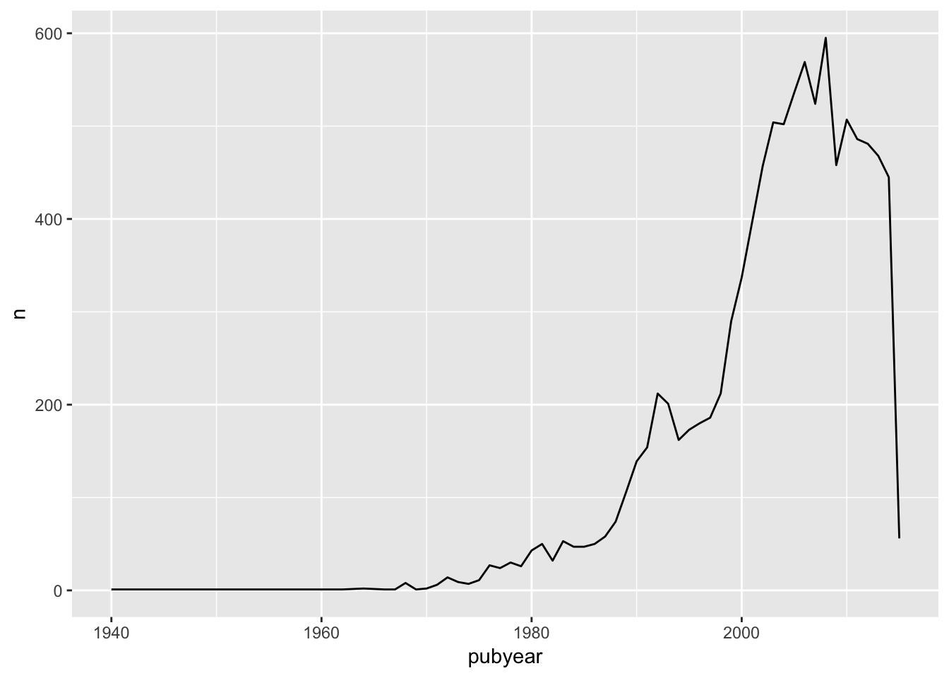
Round Up
That’s it. You may feel at the end of this post that this was a lot of work to get to a very simple graph. But, in reality, it is the data preparation that takes the time. In the next post we will focus in on creating different kinds of graph in ggplot2 and some of the challenges that we encounter along the way.